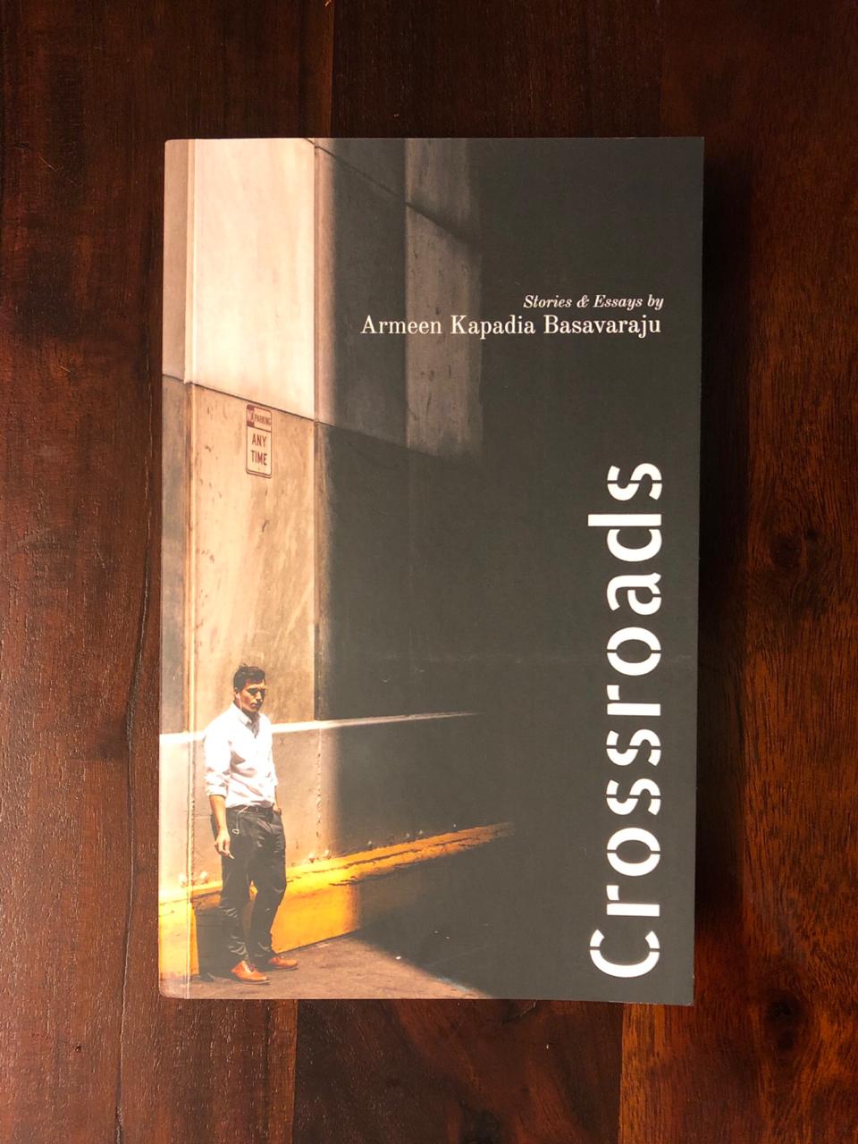
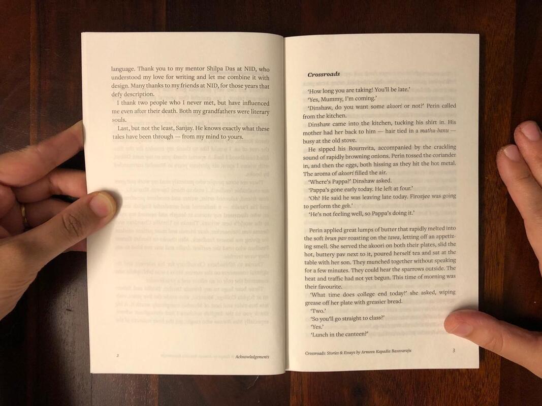
  My first book, Crossroads, was just published in May 2020!
The middle of the Covid pandemic may seem an odd time to publish a book, but it is a great time for people to read. We can't meet our family or friends, but stories can travel anywhere and keep us connected. Crossroads Paperback International https://bit.ly/crssrdspb Crossroads eBook International https://bit.ly/crssrdseb Armeen on Amazon https://bit.ly/armeenk Crossroads Paperback India https://bit.ly/crssrdsnp Crossroads eBook India https://bit.ly/crssrds
1 Comment
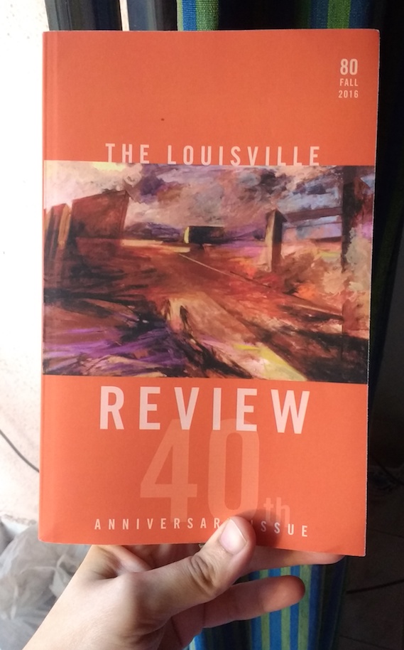 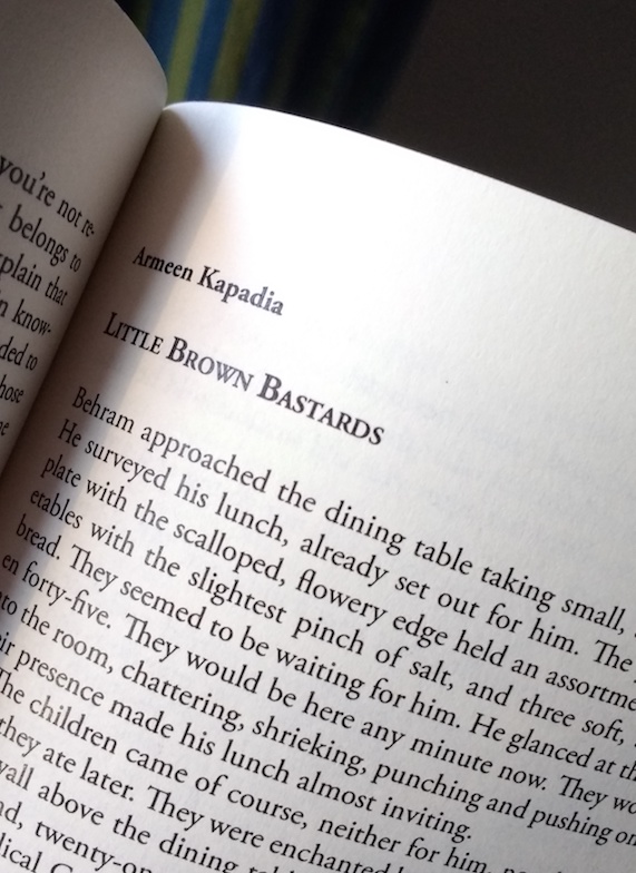 The Louisville Review has published one of my short stories in their Fall 2016 issue. Was thrilled to receive two copies of the magazine.
You can buy this issue here. A big, fat thank-you to the lovely folks at The Louisville Review. Writers & Artists is a great resource and guide for creative folk, especially writers. In February I entered their short story competition. A few days ago they informed us of the final shortlist. Was pleasantly surprised to discover that Farewell, Heidelberg (a story from my collection), made it to the shortlist. Congratulations to the winners!
For the curious ones, click here to read Farewell, Heidelberg. And let me know what you think of it! Published by Amarillo Bay, an international online literary magazine
Volume 17 Number 2 – Published 18 May 2015 -- "Is that goat eating a tire?" Mum asked, as we tried to locate the art class. "Looks like it," I replied, watching the tall, black goat with lanky locks of hair as it was chewing a bicycle tire. It seemed to be in a meditative state, its glazed eyes fixed on something in the distance. We had come to find the art class, the first in a line of many for me. By the time I was in middle school, my parents and I had come to the same conclusion. I was pretty lousy at the Sciences and Mathematics. I tolerated History and Geography. My only real loves were English and Drawing. I actually did not weep the night before the English exam. I read Wordsworth for fun. Art, Drawing or A-Perfect-Waste-Of-Time, as many people would call it, was not even a subject at my school, yet I practiced it all the time. On Sunday afternoons while the world slept, I covered sheets of paper with mountains, jungles, roads and disproportionate people. The pages of my Math and Chemistry textbooks (my sworn enemies) were covered in little doodles. These drawings were not of flowers, hearts, or ribbons, the usual candidates to adorn teenage girls' books. These drawings were of daggers dripping blood, witches stirring cauldrons, and pistols firing bullets at will. It's amazing how drawing reflects the deep subconscious. The evening before my Physics exam, Mum came to my desk expecting to find me deep in the world of velocity and electricity. I was deep, so deep into 'Chapter 13: Electromagnetism', that I had covered two pages with ice-cream cones. They dripped cream and berries all over the definitions and problems, which was a mighty big improvement on the subject, according to me. Mum sighed, shook her head and left the room. I thought I was in trouble, but instead she enrolled me for an art class. On the first Saturday of the summer vacation, I sharpened my soft lead pencils, packed my erasers, and we headed to Mr. Thakur's Art Academy. Read the full story |
 RSS Feed
