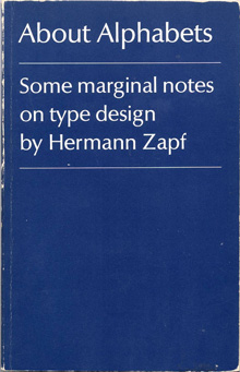
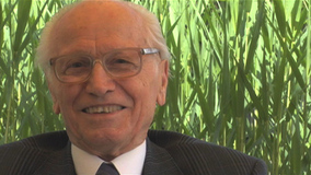
  About Alphabets – Some Marginal Notes on Type Design by Hermann Zapf The M.I.T. Press, Cambridge/Mass. And London, England The humble size and unassuming cover of this book reflect the character of the author, Hermann Zapf, in that he is not one to shout about the work he has done, even though his accomplishments in the field of type design and calligraphy are unparalleled. The book is a simple autobiography of one of the greatest graphic and type designers of our time. Written in the first person, the book is an interesting account of his early beginnings, and his development. Being trained in the old school of type design – when letters were drawn by hand and then manually cut out of metal blocks – he provides interesting insights and observations that would rarely occur to modern day typographers and graphic designers. For example, the kind of metal used to engrave out the letters was of prime importance, and it was a relief when lead was introduced, as it lent itself to re-soldering, and new bits and pieces could be fused into the original block of the letter if too much had been cut off. At the same time, several of his concerns hold true even today, such as the basic aspect of readability, and durability of the typeface after thousands of print runs. Hermann Zapf is not concerned with purely the aesthetic aspect of letter forms, (and he is a master of this) but also spends large amounts of time and energy with the functional aspect. Being a calligrapher par excellence reflects in some of his creations, of which there are several examples in the book. The author also briefly touches about his enlistment in World War 2, and the trauma it inflicted. Even during the war, he spent spare time sketching the forms of flora and fauna, as a base for a Flower Alphabet he was to create. After the war, the author starts creating typefaces for specific clients and purposes, and sets up his own Stempel Foundry. Later in the sixties he talks about his experiences in teaching in the USA, and also his involvement with book binding and publishing. As Hermann Zapf himself acknowledges, it is a hard task to write an autobiography about oneself, but he has managed it with aplomb. The book is what its title claims it to be ‘marginal notes on type design’. Although a few more personal experiences included would have encouraged more readership. Nevertheless, one can feel his passion for typefaces and their creation, when he often refers to them as ‘children’ or ‘daughters’, having different parents, and he talks about the process to ‘name’ the ‘child’. And indeed, in that time, creating a typeface was a longer and possibly harder process than having a child, with as much joy at the end. The author reflects on culture, the dwindling time people have for reading (even in those days), and how that affects the role of a type designer. Though schooled in the traditional way of creating type, he projects the new challenges for type designers, as photo-compositing and newer technologies become mainstream. Though deeply inspired by the past, by typographers and letterers of previous centuries, and masterpieces of type such as the Trajan column, he looks keenly to the future, and warns against the ‘romanticizing’ of the past. He also softly, though manifestly shows his dislike for ugly new typefaces sprouting like weeds, especially the craze of sans-serif types. The book is of small size, easy to hold, and set in Linotype Optima, one of his own graceful creations. The line spacing differs, as the closer set text is a commentary on the main text, and is an interesting way of writing an autobiography, rather like two voices of the same person speaking simultaneously. He favours unusual punctuation in place of speech marks, which is quite refreshing. Of all his fonts, my personal favourite is Zapfino, which is a delicious blend of calligraphy and typography. Somehow, he has combined the two, while doing justice to both. The result is beautiful, graceful letter forms, with generous sweeps and swirls. He is also the creator of Palatino. This is a book that anyone interested in type design and typography can read, as it is informative and inspiring. More importantly, it is a first-hand account of the journey and struggle of a type designer, the challenges he faced working with the technology at the time, and the culture prevalent in those years. 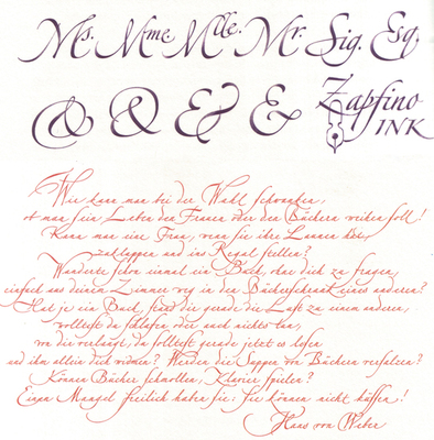
1 Comment
kajal patel
28/5/2012 10:03:09 pm
please send me some materials which can help getting admission at nid. Leave a Reply. |
Archives
June 2018
Categories
All
LinksThe New Yorker Old Blogs |
 RSS Feed
