 Today I saw The Secret Life Of Walter Mitty. A lovely, moving film, based on a short story by James Thurber. It touches many topics, directly and indirectly. Millions of people spend their lives behind a desk, never striking out on their own, never taking a risk, living lives of soul-crushing anonymity. But that’s not the issue I’m talking about. No ma’am. The movie shows the death the printed version of Life magazine. From Life in paper, it becomes Life dot com. Behind that not-so-smooth transition, many lives (pun unintended) are turned upside down by the heartless, relentless march of technology. It takes many people to make a magazine, or for that matter, any published material. Most people never understand the pain, handwork and joy that go into creating something, especially something that will be printed. Because print has an air of finality. It can’t be coded to make a correction later. There is no option to upload a new file. Written in ink equals written in stone.
Because of print’s highly demanding nature, there are many different people, each a vital performer, involved in the art of printing and publishing. Did you ever guess that there is someone like Walter Mitty, sitting in his dark room of negatives, sifting through hundreds of little images? He knows them like old friends. There is someone who colour corrects, sharpens and touches up every single image you see in any publication worth its ink. There is someone who composes the pages for print on the offset machine. Each of these people are small cogs in the larger machine. Individuals with expert, specialised knowledge. Unless you work directly with them, there is no access to that amazing tradition and well of knowledge. They never get much credit. The magazine always stands between them and the viewer, like a wall. I’m not bemoaning the rise of digital media, far from it. I love the internet, and all the information, entertainment and cat videos it houses. I’m only wondering if we are losing a entire generation of people, and with them, the knowledge and skill they had, for all time. That knowledge is of no use to us, for sure, but their stories deserve to be told. Walter Mitty tells us one such story. You can see Life online, with more photographs than ever before. But if you hold a Life magazine in your hands, you will see so much more. Behind each image, you can see a quiet person, staring at photographs for hours, checking their quality, so that you gasp wow!, and turn the page.
2 Comments
 The internet has pampered us sufficiently into believing that content is as free as the air we breathe (even if the latter is polluted as hell). There was a time in the pre-internet days when one had to pay to read. We still pay to read magazines, books, and the newspaper. The newspapers manage to keep it cheap because the advertisers are paying them. We pay just a few rupees because a corporation has paid a few crores to place their advertisement there.
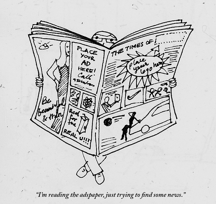
Some sites with good quality content don't wish to sell out completely to advertisers, and they charge for articles. The New York Times does that, as does The New Yorker. While initially it seems putting-off to a reader, in time it makes sense. No one can write for a living for free. And news, or content, like any other commodity or form of entertainment, comes with a price. If you like what you see, you got to pay to have it. And when there is so much not-so-great content out there, the guys who write quality stuff either have to show you ads to survive, or charge you some money. Speaking ads in your face, the Indian press media take it new heights daily. On any given day there are 3 to 4 full page ads in the Times of India. Earlier, we spotted ads in-between the news, and they stood out, because they were few. Nowadays, we spot news items between the ads. So you may have starving Bangadeshis rubbing shoulders with Katrina selling diamonds. Should there be some kind of rule on the amount a paper can advertise? More importantly, is the corporate world deciding what news gets showcased? Don't get me wrong, I have nothing against ads, but I think there can be a better balance. Advertising needs to realize its role in visual culture, and how it affects social values. Our news is stringently edited, while our advertising is not. News and advertising offer us two different kinds of information, and the line between them is blurring. How much news is still objective, is a matter of great debate. How much advertising does not tell us a lie, is a matter of no debate, its very little. The Greatest Movie Ever Sold talks about a related issue, regarding product placement in the film industry. A creatively made, but entertaining and somewhat radical documentary, it's definitely worth a watch. If there can be a city without ads, there is no reason a newspaper can have a few less too. It's a strange phenomena, but most people, including a lot of graphic designers think fonts are free as the air we breathe (which, I have no doubt, will cost us one day). But typefaces/fonts are not. A huge amount of effort goes into creating a single typeface. And that is just one basic version of it. More effort goes into creating different weights of the entire family. Yet, fonts are the most plagiarized of all resources, more than even the Internet or Wikipedia. I used some 'illegal' (not purchased) fonts too, as a student. In the Indian context, a lot of people think buying fonts is just a waste of money, not realising the importance of buying fonts for commercial and published work. Some fonts are expensive and may eat away a good chunk of their design budget. People's reactions range from:
Fonts aren't free? What the hell! Why bother, lets just use a pirated version. Why are we thinking of these fonts? Lets just download from dafont.com Can't we use this font and just change it a bit? Ok, lets use only those pre-loaded on the machine, at least that way we can save money and still be legal. Can they sue us? Lets buy some fonts. It's a good investment. Sadly a very slim percentage of the population will say that last line. People need to be informed and educated about the importance and value of fonts. A lot of people ask the second last line. It's only the fear of punishment that makes people want to do the right thing. Why should we buy fonts? 1) They are good investments. When you buy a good workhorse font, from a type foundry, it goes a long way. You get a whole font family, that could be anything from two to forty weights. Just that one font family alone can be used in innumerable ways, in countless projects, over the years. Take into account the fact that most good fonts have been around for decades (Helvetica) or centuries (Caslon, Didot, Bodoni). One solid font family purchased today can probably be used most of your lifetime. 2) It's the right thing to do. There is no other way to explain this. 3) Respect the creator. When you buy fonts, you are respecting, acknowledging and encouraging the designer somewhere, to create more. If everyone stopped buying fonts and used pirated versions, font designers would have to give up their careers. And then we would all be stuck using Helvetica forever. 4) There are fonts, and then there are fonts. Sites like dafont.com have their time and place, I believe. It's passable to use those fonts in student projects, your brother's class poster or a card for your girlfriend. In short, they are mostly (not always) amateur. It's not a great idea to use them on a client brochure, or a magazine, or for any professional/commerical work. Many times these fonts won't be kerned right, or won't have all the necessary glyphs. A lot of fonts on such sites are tweaked, squeezed and squashed versions of real, solid fonts. 5) The great are invisible. The really good fonts work invisibly and silently. They won't be shouting for you to see them. In fact, you may not notice them. They are designed to aid reading, not draw attention to themselves. So if you want people to actually read your text, and not just admire it, these are the fonts to go for. That is why big news agencies or newspapers commission their own fonts which are highly readable. Fonts are carriers and dispensers of content. Have a fontastic week. |
Archives
June 2018
Categories
All
LinksThe New Yorker Old Blogs |
 RSS Feed
