 Today I saw The Secret Life Of Walter Mitty. A lovely, moving film, based on a short story by James Thurber. It touches many topics, directly and indirectly. Millions of people spend their lives behind a desk, never striking out on their own, never taking a risk, living lives of soul-crushing anonymity. But that’s not the issue I’m talking about. No ma’am. The movie shows the death the printed version of Life magazine. From Life in paper, it becomes Life dot com. Behind that not-so-smooth transition, many lives (pun unintended) are turned upside down by the heartless, relentless march of technology. It takes many people to make a magazine, or for that matter, any published material. Most people never understand the pain, handwork and joy that go into creating something, especially something that will be printed. Because print has an air of finality. It can’t be coded to make a correction later. There is no option to upload a new file. Written in ink equals written in stone.
Because of print’s highly demanding nature, there are many different people, each a vital performer, involved in the art of printing and publishing. Did you ever guess that there is someone like Walter Mitty, sitting in his dark room of negatives, sifting through hundreds of little images? He knows them like old friends. There is someone who colour corrects, sharpens and touches up every single image you see in any publication worth its ink. There is someone who composes the pages for print on the offset machine. Each of these people are small cogs in the larger machine. Individuals with expert, specialised knowledge. Unless you work directly with them, there is no access to that amazing tradition and well of knowledge. They never get much credit. The magazine always stands between them and the viewer, like a wall. I’m not bemoaning the rise of digital media, far from it. I love the internet, and all the information, entertainment and cat videos it houses. I’m only wondering if we are losing a entire generation of people, and with them, the knowledge and skill they had, for all time. That knowledge is of no use to us, for sure, but their stories deserve to be told. Walter Mitty tells us one such story. You can see Life online, with more photographs than ever before. But if you hold a Life magazine in your hands, you will see so much more. Behind each image, you can see a quiet person, staring at photographs for hours, checking their quality, so that you gasp wow!, and turn the page.
2 Comments
After shifting to Pune a few months back, there has been lots of activity, which always comes with moving to a new place. Hence, no time to pay any serious attention to this blog. Blogs are like pets, they usually need constant attention ;-)
I had been trying to write more in detail about the process and experience of designing the NID First Day Cover. The project started in 2008 and finished around a year later. Hence, it required a little more of an effort to recall the entire experience. Just recently, Perch interviewed me electronically on the same topic, and the questions enabled me to give structure to my thoughts. You can read the interview here. 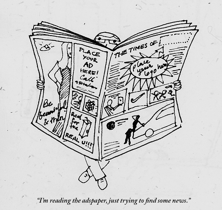 The internet has pampered us sufficiently into believing that content is as free as the air we breathe (even if the latter is polluted as hell). There was a time in the pre-internet days when one had to pay to read. We still pay to read magazines, books, and the newspaper. The newspapers manage to keep it cheap because the advertisers are paying them. We pay just a few rupees because a corporation has paid a few crores to place their advertisement there.
Some sites with good quality content don't wish to sell out completely to advertisers, and they charge for articles. The New York Times does that, as does The New Yorker. While initially it seems putting-off to a reader, in time it makes sense. No one can write for a living for free. And news, or content, like any other commodity or form of entertainment, comes with a price. If you like what you see, you got to pay to have it. And when there is so much not-so-great content out there, the guys who write quality stuff either have to show you ads to survive, or charge you some money. Speaking ads in your face, the Indian press media take it new heights daily. On any given day there are 3 to 4 full page ads in the Times of India. Earlier, we spotted ads in-between the news, and they stood out, because they were few. Nowadays, we spot news items between the ads. So you may have starving Bangadeshis rubbing shoulders with Katrina selling diamonds. Should there be some kind of rule on the amount a paper can advertise? More importantly, is the corporate world deciding what news gets showcased? Don't get me wrong, I have nothing against ads, but I think there can be a better balance. Advertising needs to realize its role in visual culture, and how it affects social values. Our news is stringently edited, while our advertising is not. News and advertising offer us two different kinds of information, and the line between them is blurring. How much news is still objective, is a matter of great debate. How much advertising does not tell us a lie, is a matter of no debate, its very little. The Greatest Movie Ever Sold talks about a related issue, regarding product placement in the film industry. A creatively made, but entertaining and somewhat radical documentary, it's definitely worth a watch. If there can be a city without ads, there is no reason a newspaper can have a few less too. I don't know what it is, but spelling and grammar mistakes seem to be on the rise. It could be the auto-correct in Microsoft Word and Google that's pampering (read spoiling) everyone's language benchmark. It could be just sheer laziness, or too many distractions around us. It could be the falling standards of education. It could be the rise of digital devices. We still don't know the real long-term implications of all this technology around us. If mobile phone waves are killing sparrows, they might be messing with our spelling skills too.
Speaking of mobiles, we can definitely dump some of the blame on the mobile phone and smsing. I love mobile phones and technology. Bt myb thts y we all rite like dis now, evn n collg. Ders no time. I hv frgten de real splings of tings. I also rite in rely shrt sntnces nw. Dis proves we can read ny wrd easly. But we can't use language like that in printed/published work (not yet at least). Language standards, in India can be surprisingly low in places where they should be high. Pick up the Times of India. On any given day, you can usually find one spelling plus one grammar mistake, and you won't even have to read the entire paper to discover them. Errors are especially rampant in the supplementary paper such as Ahmedabad Times. Surprised? Don't be. Recently, someone pointed out a spelling error in a Penguin book. English is definitely not the easiest language to master, with more exceptions than rules. The er and the ar are often confused. "I went to collage." (You couldn't have gone to a work of art). Some errors of course result in pretty hilarious situations. Recently we witnessed the 'Osama/Obama is dead' situation. A slip of one letter can mean something drastically different. Imagine the "Diving Mother that helps one in time of need." (Divine became a water sport). The slips between s and c are countless. Receive and abscess can deceive us all. And you might want to discus something or throw the discuss. Viscous can be vicious to spell. You are pretty likely to find some mistakes in this post, if you read carefully enough.  A Smile In The Mind at the NID Library  Visible Signs at the NID Library There are books on design, and then there are books on design. Some books on design simply showcase design work. They are compilations of the glitziest and best in the field, be it industrial design, typography, or illustration. Editors have worked to collect and collate the best work. Most designers tend to gravitate towards these books, especially in their design education. They seem to be the benchmark to aspire to. But in reality, these books teach little. They do affect style a lot, which may not always be desirable. This invariably creates a whole bunch of us who sub-consciously or consciously creating work that looks like the showcased work. Because like it or not, the human mind is like a sponge. Our eyes feed on things that get transmitted and processed in our hard drives (brains), and affect the kind of images and designs we later create. Meditating on the Logo Lounge book while doing a logo design job is not a great idea. Somewhere, even if we fight it, we get affected by the forms we have seen, and they tend to creep into our work. The downside is, it doesn't help original thought. Most of these showcase kind of books are nice to browse through at times. But they don't provide many insights, and they don't really teach anything of real value, about design. The kind of books that make a huge impact are of a different pedigree altogether. They don't just show work, they challenge the way we work, and create new ways for us to think. One is, A Smile In The Mind by Beryl McAlhone, a must-read for any graphic designer. This is an excellent book to help one understand how to create images (images=any kind of visual communication). It explains the different kinds of images, visual puns, visual metaphors and so on. By studying the book one can analyse and understand images around us better. It helps to create images, and develop different kinds of thinking to create images. The book explains creativity, humour and visual wit, and their roles in design. Another great book is Visible Signs by David Crow. As consumers of visual art, people have become advanced readers of signs and signals. We decode meaning from images on many different layers. It is important for designers to have an understanding of how meaning is formed, and how it changes perceptions. Our desires, and our sense of our own identities are moulded and manipulated by signs and images around us. Communication has hierarchies that are deeply embedded in our societies. This also holds true for visual communication, different media carry different messages for us regardless of the content of the message. Visual language spans the full range of cultural and economic activity. Visible Signs makes us aware of implicit communication everywhere. Designing Design by Kenya Hara does showcase his design work, but in a much deeper way. Unlike most books which just show a final outcome, he shows and explains the entire process behind each piece of work. Not only is his design work phenomenal, but his writing is interesting and lucid. He gives many insights into Japanese culture, which is strongly reflected in his work. Change By Design by Tim Brown (a founder of IDEO) talks about the design work IDEO has done through the years. It has few images, but many lessons and insights. It is a great book on design thinking, and shows the power of design in systems. Designers rarely talk about the business aspect of their profession. Shel Kerby's Talent Is Not Enough is an eye-opening book. It has got everything a designer would need to know about actually running a design business, charging clients, making proposals and so on. Few of these things get taught in design school, so this book is an essential read. John Heskett's A Short Introduction to Design is a good read about what design encompasses. The Vignelli Canon by Massimo Vignelli is a superb summation of the process of designing. For graphic designers, especially publication designers, the big daddy of them all is The Grid System by Joseph Muller Brockmann. This book was published sometime in the late 1960s, but it is still a Bible for graphic designers today. The principles of good design don't change easily, and this book has been written by one of the masters. This gentleman practically invented the grid system. He then also articulated it and made it easy for mere mortals like us to understand. These same principles are differently applied on the web, iPad, and any device today. This book explains the skeleton of good design. You never see it, but without it everything collapses. The grid is so important because it creates the system. The system creates hierarchy and consistency. These two together gives the reader essential cues. The cues help the reader read. One kind of book is the icing, while the other is the recipe for the cake. Many books strongly influence style, without really educating. Few books actually make designers. If design is problem-solving, these solid books are educators in their own way. Happy reading!  Grid Systems  Joseph Muller Brockmann |
Archives
June 2018
Categories
All
LinksThe New Yorker Old Blogs |
 RSS Feed
