|
After shifting to Pune a few months back, there has been lots of activity, which always comes with moving to a new place. Hence, no time to pay any serious attention to this blog. Blogs are like pets, they usually need constant attention ;-)
I had been trying to write more in detail about the process and experience of designing the NID First Day Cover. The project started in 2008 and finished around a year later. Hence, it required a little more of an effort to recall the entire experience. Just recently, Perch interviewed me electronically on the same topic, and the questions enabled me to give structure to my thoughts. You can read the interview here.
2 Comments
Just finished proofreading somebody's Diploma (thesis) document. I don't have any right to divulge the topic and the details of it, but part of it was about the development of language, script and how we read letters and words. There is still no really conclusive theory on how language developed. Was it to express emotion, need, signal danger, or for the purpose of trade? Who knows. We don't really know how or why humans started making intelligent sounds and then giving signs to the sounds they made. This was a huge evolutionary leap. Animals too have complex language and communication systems, but human language has developed to an abstract system of signs.
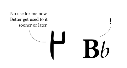
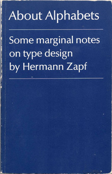
The letter A is just a notion of the sound it represents. The 'A' could well be a square or circle instead of A. At some point in our long and convoluted history somebody decided we needed signs to communicate. And that was the beginning of script. Many scripts developed out of a need to keep accounts for trade purposes. Stringing these signs together in various groups led to the formation of words and sentences. We never really read every letter in a word, we just read the word as a group. Reading is as much about pictures as it is about words, because at the end of the day, words are pictures. When someone asks the spelling of the word, one may actually see the word in their head, and know that if it 'looks' wrong, the spelling is wrong. I know, for instance, the i must come after the e, by the image in my head. If e is before i, my brain recognizes it is visually wrong. It doesn't spell wrongly, it looks wrong. It is easier to know spelling when you visualize it. The images of letters that we know today have developed over thousands of years. We have accepted them as much as we have accepted the noses on our faces. Language (especially one's mother tongue) seems to be hard-wired in us. There is very little effort required in thinking or talking in one's mother tongue. We all learnt language at such a tender age, we usually cannot recollect anything to do with the process. It probably wasn't very hard, or we would have vivid memories of it. Learning a second language however, usually proves harder. Most people remember struggling, or at least making more efforts with Hindi, Marathi, English, French or any other language that they learned a little later. Between the ages of approximately 2 to 6, the 'language window' in little human brains is wide open, more than it will ever be in life again. Between these years, children can effortlessly pick up 3 or 4 languages being spoken around them. No one (or very few) will question why A looks the way it does. Why can it not look like X, or a circle? World over, the speakers of a language have a general, unspoken agreement over the form of letters. Adding or removing a letter from a language is like adding or removing a limb. Generations may pass before people realise the loss of a letter, or even a matra. And by then it may be too late to bring it back. Most people may ask, what's the big deal in the loss of a letter, the language is simply evolving. That may be the case, but the loss is still very real. A letter may not have a tangible value, but it carries a wealth of information, symbology, history, culture and identity with it. Adding a letter is also serious business. First, the need for a new letter needs to be strongly felt by most people. How will people know what a new letter means, unless it is told to them repeatedly? Somehow, words are easily dropped from and added to any working language, but letters, not so easily. The loss of languages is a very real threat to culture and diversity world over. We are illiterate when we look at ancient scripts. The Indus Valley script still has the world flummoxed after thousands of years. Changes in scripts have occurred over millennia, often for very down-to-earth reasons. For instance, Gujarati lost the line on top of the letters that Devnagari has simply because the Gujaratis are predominantly a business and trading community, and the loss of the line enabled them to write faster for maintaining accounts and lists. Similarly, a thousand years from now our alphabet may be completely different. We form the language we speak, but it also forms us. About Alphabets – Some Marginal Notes on Type Design by Hermann Zapf
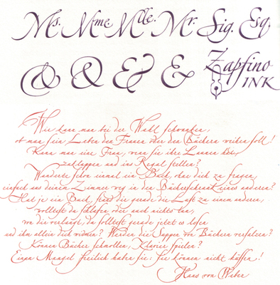
The M.I.T. Press, Cambridge/Mass. And London, England The humble size and unassuming cover of this book reflect the character of the author, Hermann Zapf, in that he is not one to shout about the work he has done, even though his accomplishments in the field of type design and calligraphy are unparalleled. The book is a simple autobiography of one of the greatest graphic and type designers of our time. Written in the first person, the book is an interesting account of his early beginnings, and his development. Being trained in the old school of type design – when letters were drawn by hand and then manually cut out of metal blocks – he provides interesting insights and observations that would rarely occur to modern day typographers and graphic designers. For example, the kind of metal used to engrave out the letters was of prime importance, and it was a relief when lead was introduced, as it lent itself to re-soldering, and new bits and pieces could be fused into the original block of the letter if too much had been cut off. At the same time, several of his concerns hold true even today, such as the basic aspect of readability, and durability of the typeface after thousands of print runs. Hermann Zapf is not concerned with purely the aesthetic aspect of letter forms, (and he is a master of this) but also spends large amounts of time and energy with the functional aspect. Being a calligrapher par excellence reflects in some of his creations, of which there are several examples in the book. The author also briefly touches about his enlistment in World War 2, and the trauma it inflicted. Even during the war, he spent spare time sketching the forms of flora and fauna, as a base for a Flower Alphabet he was to create. After the war, the author starts creating typefaces for specific clients and purposes, and sets up his own Stempel Foundry. Later in the sixties he talks about his experiences in teaching in the USA, and also his involvement with book binding and publishing. As Hermann Zapf himself acknowledges, it is a hard task to write an autobiography about oneself, but he has managed it with aplomb. The book is what its title claims it to be ‘marginal notes on type design’. Although a few more personal experiences included would have encouraged more readership. Nevertheless, one can feel his passion for typefaces and their creation, when he often refers to them as ‘children’ or ‘daughters’, having different parents, and he talks about the process to ‘name’ the ‘child’. And indeed, in that time, creating a typeface was a longer and possibly harder process than having a child, with as much joy at the end. The author reflects on culture, the dwindling time people have for reading (even in those days), and how that affects the role of a type designer. Though schooled in the traditional way of creating type, he projects the new challenges for type designers, as photo-compositing and newer technologies become mainstream. Though deeply inspired by the past, by typographers and letterers of previous centuries, and masterpieces of type such as the Trajan column, he looks keenly to the future, and warns against the ‘romanticizing’ of the past. He also softly, though manifestly shows his dislike for ugly new typefaces sprouting like weeds, especially the craze of sans-serif types. The book is of small size, easy to hold, and set in Linotype Optima, one of his own graceful creations. The line spacing differs, as the closer set text is a commentary on the main text, and is an interesting way of writing an autobiography, rather like two voices of the same person speaking simultaneously. He favours unusual punctuation in place of speech marks, which is quite refreshing. Of all his fonts, my personal favourite is Zapfino, which is a delicious blend of calligraphy and typography. Somehow, he has combined the two, while doing justice to both. The result is beautiful, graceful letter forms, with generous sweeps and swirls. He is also the creator of Palatino. This is a book that anyone interested in type design and typography can read, as it is informative and inspiring. More importantly, it is a first-hand account of the journey and struggle of a type designer, the challenges he faced working with the technology at the time, and the culture prevalent in those years. I'm really grateful to advertisers and sponsors for letting us get glimpses of movies and programmes on TV between the hours of advertising. Besides being thoroughly entertaining, brainwashing and mind-numbing, ads provide some real insights into mainstream culture. There are some ads on TV that are genuinely good, humourous and make their point. But a good amount of Indian advertising presumes people will believe anything, such as:
1) Indian roads are smooth, wide, empty surrounded by greenery, beautiful and India looks like a first world country.You can race your bike/car on them as much as you like. And super hot girls in mini skirts fill petrol at the petrol pumps. 2) It is really important that you be fair, so every company makes a 'fairness' cream. Nowadays even men need fairness creams, and smoothening face gels, so that they don't feel left in the dark, quite literally. In a country of beautiful, brown complexion, it is now extremely important to look like a super-white cartridge sheet. The 'brightness' option on Photoshop has never been misused to such effect. 3) As soon as you are born, you start ageing, so you must start using an anti-aging cream when you are around ten. Or heaven help you, you will look twenty by the time you are err.. twenty. 4) Your existing mobile phone is never good enough for you, even if you just bought it. Make sure you upgrade asap. Otherwise how will you get all those cool friends? 5) You really haven't arrived till you have a fancy new bathroom, that is probably bigger than your living room. 6) Hair colour is very important, almost as crucial as face colour. But in hair colour, darker is better, and you should really start hiding those grey strands at sixteen. 7) There is really a lot to be said about hair, and yours is not strong enough until you can tie it to the front bumper of a truck, and pull the truck along. To do that, you need to only use a Long and Strong Shampoo, because as we all know, it's so normal to be using your extra long hair to pull automobiles along the road. 8) While on the topic of our crowning glories, there are now enough shampoos. conditioners, detanglers and hair products to keep Rapunzel busy for the rest of her life. There is stuff for long hair, straight hair, curly hair, falling hair, dry hair, sticky hair, thin hair, thick hair, no hair, dandruffy hair, coloured hair, white hair, and split ends, because you're worth it. Most important, when you don't have a real concept to sell a product or service, or you can't find its distinctive advantage, just make any member of the Indian Cricket Team endorse the thing. This will ensure that half the nation will at least blindly watch the commercial, and not flick channels. They might even purchase that product. If a cricketer is telling you that you need it, then you need it, whether it is a fancy car, cooking oil, or hair conditioner. When in doubt, always fall back on our boys in blue. Back in the day, ads were created to let you know about the real function or advantage of the product. They were direct, simple and more honest. With increasing production, choice and consumerism, today they have to all compete with numerous others in the market. So now it's more about lifestyle, experience, brand and how important it is just to purchase it. What you already have is never good enough, famous enough, or beautiful enough. We are victims of the Ad Age. You need more, even if you really don't need more. The next time you are watching the idiot box, make sure you don't become the idiot in front of it. There are books on design, and then there are books on design. Some books on design simply showcase design work. They are compilations of the glitziest and best in the field, be it industrial design, typography, or illustration. Editors have worked to collect and collate the best work. Most designers tend to gravitate towards these books, especially in their design education. They seem to be the benchmark to aspire to. But in reality, these books teach little. They do affect style a lot, which may not always be desirable. This invariably creates a whole bunch of us who sub-consciously or consciously creating work that looks like the showcased work. Because like it or not, the human mind is like a sponge. Our eyes feed on things that get transmitted and processed in our hard drives (brains), and affect the kind of images and designs we later create. Meditating on the Logo Lounge book while doing a logo design job is not a great idea. Somewhere, even if we fight it, we get affected by the forms we have seen, and they tend to creep into our work. The downside is, it doesn't help original thought. Most of these showcase kind of books are nice to browse through at times. But they don't provide many insights, and they don't really teach anything of real value, about design.
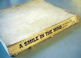
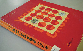
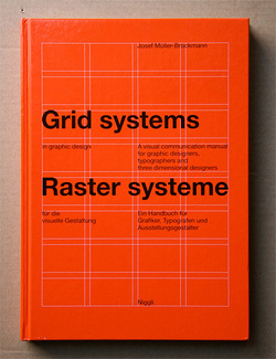
The kind of books that make a huge impact are of a different pedigree altogether. They don't just show work, they challenge the way we work, and create new ways for us to think. One is, A Smile In The Mind by Beryl McAlhone, a must-read for any graphic designer. This is an excellent book to help one understand how to create images (images=any kind of visual communication). It explains the different kinds of images, visual puns, visual metaphors and so on. By studying the book one can analyse and understand images around us better. It helps to create images, and develop different kinds of thinking to create images. The book explains creativity, humour and visual wit, and their roles in design. Another great book is Visible Signs by David Crow. As consumers of visual art, people have become advanced readers of signs and signals. We decode meaning from images on many different layers. It is important for designers to have an understanding of how meaning is formed, and how it changes perceptions. Our desires, and our sense of our own identities are moulded and manipulated by signs and images around us. Communication has hierarchies that are deeply embedded in our societies. This also holds true for visual communication, different media carry different messages for us regardless of the content of the message. Visual language spans the full range of cultural and economic activity. Visible Signs makes us aware of implicit communication everywhere. Designing Design by Kenya Hara does showcase his design work, but in a much deeper way. Unlike most books which just show a final outcome, he shows and explains the entire process behind each piece of work. Not only is his design work phenomenal, but his writing is interesting and lucid. He gives many insights into Japanese culture, which is strongly reflected in his work. Change By Design by Tim Brown (a founder of IDEO) talks about the design work IDEO has done through the years. It has few images, but many lessons and insights. It is a great book on design thinking, and shows the power of design in systems. Designers rarely talk about the business aspect of their profession. Shel Kerby's Talent Is Not Enough is an eye-opening book. It has got everything a designer would need to know about actually running a design business, charging clients, making proposals and so on. Few of these things get taught in design school, so this book is an essential read. John Heskett's A Short Introduction to Design is a good read about what design encompasses. The Vignelli Canon by Massimo Vignelli is a superb summation of the process of designing. For graphic designers, especially publication designers, the big daddy of them all is The Grid System by Joseph Muller Brockmann. This book was published sometime in the late 1960s, but it is still a Bible for graphic designers today. The principles of good design don't change easily, and this book has been written by one of the masters. This gentleman practically invented the grid system. He then also articulated it and made it easy for mere mortals like us to understand. These same principles are differently applied on the web, iPad, and any device today. This book explains the skeleton of good design. You never see it, but without it everything collapses. The grid is so important because it creates the system. The system creates hierarchy and consistency. These two together gives the reader essential cues. The cues help the reader read. One kind of book is the icing, while the other is the recipe for the cake. Many books strongly influence style, without really educating. Few books actually make designers. If design is problem-solving, these solid books are educators in their own way. Happy reading! As the title suggests, I have been toying with various subject matters to write about. Should I write about design, write about writing, write about India, people, places, food, the importance of breakfast, the rise of consumerism, the rise of food prices, the state of education, the lack of good education, the pitfalls of design education, the vanishing forest cover, the vanishing Parsis, the almost vanished tigers, ugly urban architecture, beautiful traditional architecture, unbelievable politicians, soaring corruption, starving farmers, farmers with BMWs, mobile phone plans, fair and lovely/handsome advertisements, creeps on motorbikes, families on scooters, chauffeurs in Audis, bhelwallas, the helpful staff at the Bank of India, the not-so-helpful staff at the Pune bus stand, chaotic traffic, load-shedding, weight-gaining, Indesign crashing, the superior nature of Apple, or the charm of the printed word?
Speaking of words, people say we don't think in words, we think in pictures, but I think that we think in words too. If a picture is worth a thousand words, then a word is also worth a thousand pictures. Words and pictures, or language and visuals are two sides of the same coin, the coin of communication or expression. As human beings we can't live without these two essential tools of our own creation. The earliest humans expressed themselves through images, as seen in cave paintings. Even today some of the richest expressions, such as those of tribal artists, are in the form of images. Language came much later. But then language turned out to be such a powerful, fascinating tool, and gripped humankind with such intensity for generations, that now we can't live without it. It is as essential to us as breathing. More than the Printing Revolution, or the Internet Revolution, it must have been the Language Revolution, or rather Evolution, that has actually had the maximum impact on us till today. I was flitting through a book Empires of the Word — A Language History of the World by Nicholas Ostler, and it's fascinating to see how one can actually study the history of the world through its languages. Language is deeply intertwined with perception, colonization, economic strength, religion, and much more. Indeed language is much more than just words. It's how we think, how we feel, it's the lens to our entire reality. Any language has phrases, metaphors, and even certain words unique only to that language, and carries in it centuries or millennia of meaning, culture and tradition. Language has DNA as well, in its words, sounds, subtle meanings and double meanings. Concepts of gender, direction, transaction, self-consciousness and ego-centricity stem from language and are affected by it. Does your language shape how you think? I think yes. Though the language of designers is visuals (supposedly), there are some designers on whom the wordy language still has a strong grip. A very interesting project is Mandagrams by Johnson Banks, an amazing graphic amalgamation of two languages. It almost seems like a return to hieroglyphics. With the rise of mobile technology and twitter-talk, maybe the future of language will be some kind of 'designed' system of modern, hyper-efficient and ultra minimalist hieroglyphics. |
Archives
June 2018
Categories
All
LinksThe New Yorker Old Blogs |


 RSS Feed
