 Today I saw The Secret Life Of Walter Mitty. A lovely, moving film, based on a short story by James Thurber. It touches many topics, directly and indirectly. Millions of people spend their lives behind a desk, never striking out on their own, never taking a risk, living lives of soul-crushing anonymity. But that’s not the issue I’m talking about. No ma’am. The movie shows the death the printed version of Life magazine. From Life in paper, it becomes Life dot com. Behind that not-so-smooth transition, many lives (pun unintended) are turned upside down by the heartless, relentless march of technology. It takes many people to make a magazine, or for that matter, any published material. Most people never understand the pain, handwork and joy that go into creating something, especially something that will be printed. Because print has an air of finality. It can’t be coded to make a correction later. There is no option to upload a new file. Written in ink equals written in stone.
Because of print’s highly demanding nature, there are many different people, each a vital performer, involved in the art of printing and publishing. Did you ever guess that there is someone like Walter Mitty, sitting in his dark room of negatives, sifting through hundreds of little images? He knows them like old friends. There is someone who colour corrects, sharpens and touches up every single image you see in any publication worth its ink. There is someone who composes the pages for print on the offset machine. Each of these people are small cogs in the larger machine. Individuals with expert, specialised knowledge. Unless you work directly with them, there is no access to that amazing tradition and well of knowledge. They never get much credit. The magazine always stands between them and the viewer, like a wall. I’m not bemoaning the rise of digital media, far from it. I love the internet, and all the information, entertainment and cat videos it houses. I’m only wondering if we are losing a entire generation of people, and with them, the knowledge and skill they had, for all time. That knowledge is of no use to us, for sure, but their stories deserve to be told. Walter Mitty tells us one such story. You can see Life online, with more photographs than ever before. But if you hold a Life magazine in your hands, you will see so much more. Behind each image, you can see a quiet person, staring at photographs for hours, checking their quality, so that you gasp wow!, and turn the page.
2 Comments
Now I've never been a hard-core Tarantino fan. I've seen Pulp Fiction, and thoroughly enjoyed it. I've watched bits and pieces of both Kill Bills, wincing as blood flew. But his last two movies have been wonderful, perfect movie-watching experiences. The one that really made me a fan is of course, that glorious piece of film-making called Inglorious Basterds. From the opening scene, it gets you in it's grip, and it doesn't let you go. It's story is perfect, and more importantly, it's perfectly told. QT knows what to tell you, what to show you, and when to show it to you.
Many people don't like Tarantino films because of their graphic violence. Indeed, they are not for the faint-hearted. If bullets and blood flying, people getting their genitals blown to bits, and dogs tearing people apart is not your cup of tea, don't venture into this territory. You've been warned. I'm not a fan of extreme violence. But I didn't seem to mind it in these movies. It's the tale of revenge, the story of how the oppressed rises up one day, and gives it back to the oppressor, it's the underdog becoming top-dog, and it leaves the audience cheering for more. The best part is, it's not the scenes of violence that really stay with you. It's the other, far more subtle things that get stuck in your head. One of the best scenes in Inglorious Basterds is when Shoshanna, meets Colonel Hans Landa in the Nazi officers club, for the first time since he shot her family to pieces. Inglorious Basterds unfolds like a book, slowly, revealing a complex plot. At the end of the movie you are left wishing something like that really happened in World War 2. Django Unchained is set in America before the civil war. Unlike Inglorious Basterds, it's plot and story is very simple and straightforward. Perhaps for this reason, some people may not like it, but this is it's chief charm. Django may have a simple story, but it makes up in the richness of its characters. They are endlessly entertaining. They are human, there is something that breaks each of them at different points. There are some traumatic scenes of violence such as a horrendous wrestling match, dogs tearing a slave to pieces, and other such scenes. But there are some remarkable moments. One is when Django's wife is brought out of the hot-box, where she has been kept as punishment for trying to run away. You will rarely see a film showing a naked, shamed woman, without showing nakedness or shame. Somehow, QT masters it. There is the terrible moment when the hot-box is opened, water is thrown on her, and several white men pull her out, and literally man-handle her. This could have been a very ugly scene, but it is heart-wrenching without being explicit. It shows the cruelty, but it handles it sensitively. Another fantastic moment comes towards the end. Dr Shultz (Christof Waltz) is haunted by the scenes of the slave being torn to pieces by dogs. Until there he has maintained his strength, but suddenly, one senses the cracks appearing in his calm state of mind. He seems a character who can absorb many disturbing things, and he himself kills people without qualms, but this experience shatters something deep within him, and unravels him. If there is that one moment in life when someone can't take something anymore, this is it for him. It's a very telling moment. The audience knows that something in him has changed, and he is going to do something extreme, or crazy, but you just don't know what. It's easy to underestimate the acting talent of Jamie Foxx, because he is a man of few words in this film. But as you watch the entire film, he communicates volumes without words. Experiences have toughed him up, but they haven't made him inhuman. He's a simple man, with a simple mission. His greatest strength is he learns fast. His greatest weakness is his love for Hildi, his wife. He can bear anything, but Hildi is his Achilles' heel. Leonardo DiCaprio is perfect, charming, funny, kind but with a hard, cruel, hypocritical and almost psychotic core. His character is unveiled beautifully. Initially, you like him. He charms. Slowly, you fear and dread him. His unpredictability leaves one on the edge of the seat. Samuel L Jackson is brilliant as the faithful slave, serving a family since generations. He is so identified with his role of the servant, that he cannot believe that any black person can be anything else. He is the most annoying, cloying, racist person in the movie. Of course, Christof Waltz takes the cake, as he does in Inglorious Basterds. In both these movies he is a ruthless killer, who is delightfully cheerful and practical about his work. But in Django, he is a softer, more interesting, more nuanced character. He is the most likeable, pragmatic, person, who takes life with a pinch of salt. If one wanted a traveling companion, one really couldn't ask for a better one. He is honest, brutal, and takes things as they come. Most enjoyable, even strangely touching, is the way he takes Django under his wing. Theirs seems like an unlikely partnership. But it's the best there is. It broke my heart when they killed him. I think I could have accepted Django' death easier than his. But it was a good ending. Most amazingly well shown is the attitude that QT exposes, through the dialogues, the brilliant screenplay. The attitude that any oppressor has, he feels justified in his actions. He genuinely believes it is his birthright to oppress, to rule, to own. This belief is so strong, that even the oppressed believe it blindly. They deeply resent anyone who upsets this balance. Samuel L Jackson brings this to life. Black slaves resent a black man who is free, and who rides a horse alongside the white men. After shifting to Pune a few months back, there has been lots of activity, which always comes with moving to a new place. Hence, no time to pay any serious attention to this blog. Blogs are like pets, they usually need constant attention ;-)
I had been trying to write more in detail about the process and experience of designing the NID First Day Cover. The project started in 2008 and finished around a year later. Hence, it required a little more of an effort to recall the entire experience. Just recently, Perch interviewed me electronically on the same topic, and the questions enabled me to give structure to my thoughts. You can read the interview here. 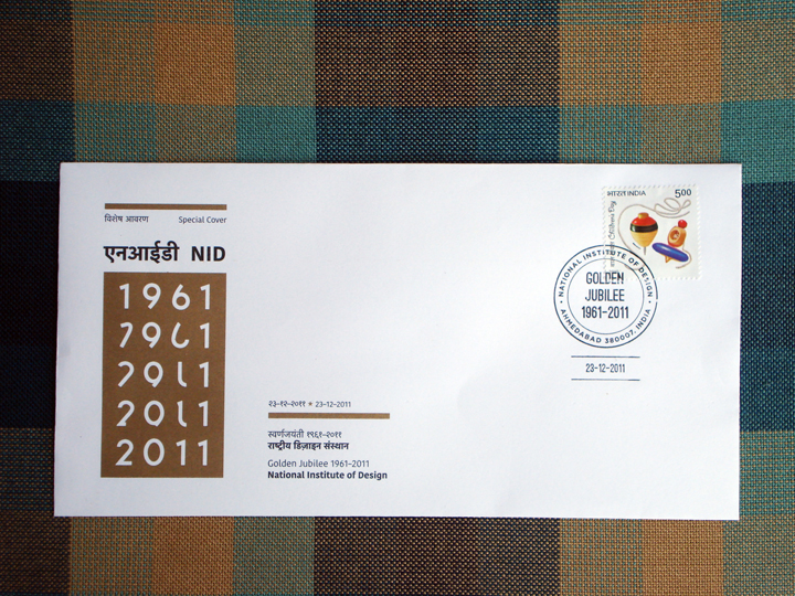 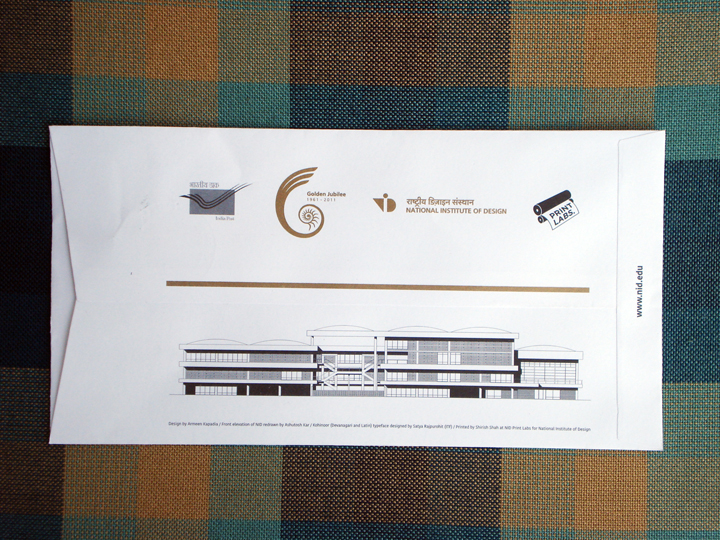 A Special Cover is much like a First Day Cover, but it does not have a commemorative postage stamp like a First Day Cover has. One can put any stamp on it to post it.
This cover was designed as part of my Diploma Project in 2008. The guide for the project was Shilpa Das, and the sponsor was Research & Publications, NID. It was released on December 23, 2011, in Baroda. Many thanks to Pradyumna Vyas and Shilpa Das for facilitating the process with India Post. Many thanks to Tarun Deep Girdher, Shirish Shah and the entire staff of NID Print Labs for tirelessly and patiently working to do a great job of it. Many thanks to Satya Rajpurohit of Indian Type Foundry for letting us use the Kohinoor Latin and the accompanying Kohinoor Devnagari typefaces on the Cover. Many thanks to Ashutosh Kar, a senior from Graphic Design, NID, whose drawing of the NID elevation we used on the back of the cover. Many thanks to Elton, Vidhi, Vijith, Shivani, Sanjay and others who stuck stamps and folded envelopes in the Printing Lab. Many, many thanks to Sanjay Basavaraju for looking after the whole process, co-ordinating, and making it happen. Lots was learnt in the course of this project, and will share more of that and all the experiences later. Will update this post with details of the project and more images post 15th February 2012. These Special Covers are available with Research & Publications, NID. 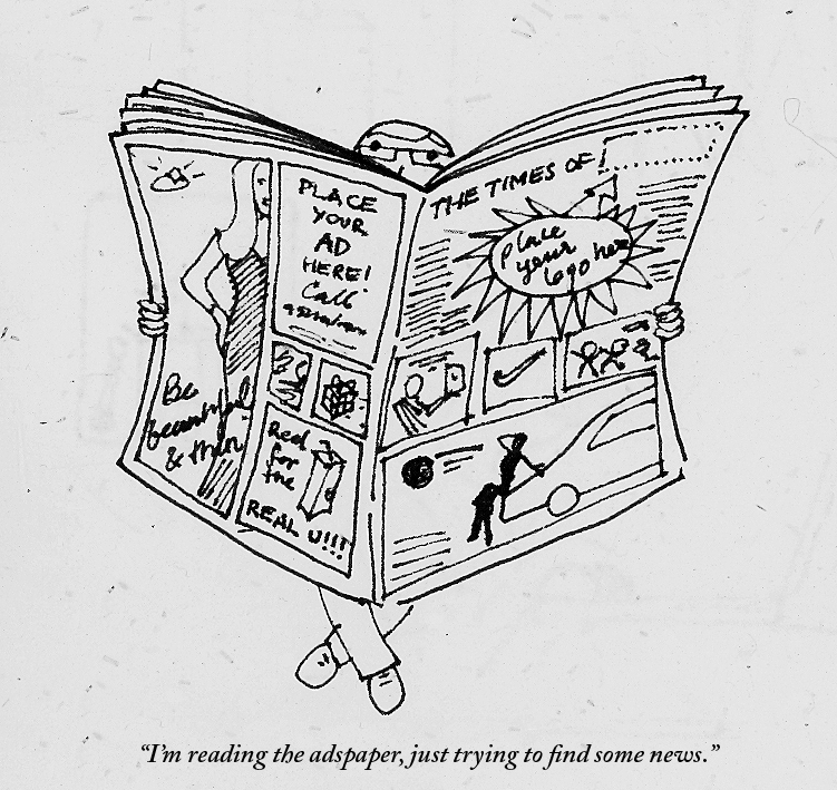 The internet has pampered us sufficiently into believing that content is as free as the air we breathe (even if the latter is polluted as hell). There was a time in the pre-internet days when one had to pay to read. We still pay to read magazines, books, and the newspaper. The newspapers manage to keep it cheap because the advertisers are paying them. We pay just a few rupees because a corporation has paid a few crores to place their advertisement there.
Some sites with good quality content don't wish to sell out completely to advertisers, and they charge for articles. The New York Times does that, as does The New Yorker. While initially it seems putting-off to a reader, in time it makes sense. No one can write for a living for free. And news, or content, like any other commodity or form of entertainment, comes with a price. If you like what you see, you got to pay to have it. And when there is so much not-so-great content out there, the guys who write quality stuff either have to show you ads to survive, or charge you some money. Speaking ads in your face, the Indian press media take it new heights daily. On any given day there are 3 to 4 full page ads in the Times of India. Earlier, we spotted ads in-between the news, and they stood out, because they were few. Nowadays, we spot news items between the ads. So you may have starving Bangadeshis rubbing shoulders with Katrina selling diamonds. Should there be some kind of rule on the amount a paper can advertise? More importantly, is the corporate world deciding what news gets showcased? Don't get me wrong, I have nothing against ads, but I think there can be a better balance. Advertising needs to realize its role in visual culture, and how it affects social values. Our news is stringently edited, while our advertising is not. News and advertising offer us two different kinds of information, and the line between them is blurring. How much news is still objective, is a matter of great debate. How much advertising does not tell us a lie, is a matter of no debate, its very little. The Greatest Movie Ever Sold talks about a related issue, regarding product placement in the film industry. A creatively made, but entertaining and somewhat radical documentary, it's definitely worth a watch. If there can be a city without ads, there is no reason a newspaper can have a few less too. 17–19 December 2010
National Institute of Design, Ahmedabad, India The last weekend was an interesting and informative one with the 14th conference of Vision Plus being held for the first time in a developing country, and whats more, right on home ground! Yes, it was organised by IIDj (Institute for Information Design Japan) and the NID (National Institute of Design) played host making it a great experience for all. There were numerous speakers from all over the globe and India, and the topics were diverse, ranging from mobile technology, to signage, to interfaces, to medicine packaging, to rural communication. There were eye-opening discussions, and I came away re-thinking the entire role of graphic design, and the growing importance of information design. Too many things around us, in fact the very important things around us are badly or inappropriately designed. It is an irony that we live in world where the Nike logo and packaging will be perfectly designed, but your bank form will be a test of patience and eyesight. Millions are spent on communication that will sell, but too little is invested in communication that will aid. Overall, some of the things I came away with are: 1) Text is as important as design (yay!). This was something I personally had felt since a long time, since I joined NID. The words that are forming part of your communication, be it online, in a leaflet, or on a strip of Crocin are important. Because people WILL read. They won't get the information they need just from admiring your pretty fonts. Re-writing the text, and re-structuring the text is as important, and in fact the first stage in providing a solution. Good design is not enough when the text itself is confusing or unclear. Of course good design really, really helps in communication, once the text is coherent. This was reaffirmed time and again in Vision Plus, especially by certain presenters such as Karel van der Waarde and Alex Tyers. Karel can der Waarde showed us how medicine packaging is mostly unreadable, and inaccessible even in Europe (surprise surprise!). Often pamphlets or some kind of literature is handed out with medicines in Europe, and these are hard to read. Even the text itself is confusing. Medicines have numerous complexities and layers such as one can't consume a certain drug if one has one of the ten conditions mentioned. This is often where text appears to repeat itself or get redundant. 2) Intuition is not enough. Too often designers tend to think that they know best, but as designers we have to go out there and understand users time and again. When we think something will work, we are just taking a personal stand point, and are missing out on hundreds of voices and opinions which may provide some enlightening insights. Design is not about personal choice and preference. 3) Research—design balance. A great question put forward by Karel van der Waarde (I think) in the end was how much should we as designers research, where do we draw the line, how do we walk that fine line of research and design? As Professor Ranjan (of NID) summed up, there is evidence-based design and design-based evidence, and they both are on two sides of a river, which needs to be bridged. 4) Design is focussed on what looks good rather that what works. Many people expressed this point, among them Jay Rutherford and Alex Tyers. Jay Rutherford rightly said that a standardly educated graphic designer tends to worry about how it will look rather than how it will work. This is the crux of the problem and the reason we encounter so much lousy design around us today. Most people (including many designers in India) think that if it looks beautiful its enough, even if the user can't read the 9pt type. This fascination with tiny typography actually rules out a huge reader base of forty-plus people, and those with weak eyesight. This can be accepted in a fashion magazine but not on heart medication, or insurance policies. 5) Design as a term is changing meaning daily. Today design may be enabling users to create their own solutions through workshops or other means. It could be helping people create their own tools to improve their life. Design is no longer 'giving' a 'solution'. Problems are being solved in new ways everyday. 6) You can't parachute into another culture to 'give' design solutions and parachute out. Jay Rutherford pointed out that too often Western designers think they can land in developing countries, tell people what to do, and leave. This, according to him, is a bad way of doing things. And I agree. Its not that Western designers cannot help developing countries, but they need to first spend months if not years in understanding the context, as it is so different and varied. An audience member rightly summed it up as 'we have to understand that we don't understand everything about other cultures'. Mr. Rutherford explained how information design in India is such a complex thing. Take the domain of road signage. Presently they are haphazard, and inconsistent. There is no system in short. We actually need city signage in three languages — Hindi, English and the local language. Now again, which order should they be in, and how large each should be is a matter of debate. Mr. Rutherford had a very keen observation about our Indian airports which set me thinking. He noticed, while in Bangalore airport, that the English signage was much larger than the Hindi and Kannada signage which immediately followed it. He was wondering why this was, and indeed it is strange that our own local languages have secondary importance. Probably we are one of the very few countries in the world to do that. Is it the colonial hangover? Is it because most people who can afford air travel are also predominantly English readers? 7) Culture and context are everything. Lakshmi Murthy and Tarun Deep Girdher showed us how important understanding a local culture is. And how rural India is a different world, of which we urban designers know naught. In rural India, the simplest of devices can work most effectively. I especially loved Lakshmi Murthy's solution for the pregnant women in rural Rajasthan. These women do not eat a proper diet during pregnancy because of many myths and habits. Women often eat last, and they eat left-overs. They sometimes believe things such as the baby needs space to grow, so don't fill that space with food, and so on. After educating the women on the importance of food, she has a simple tool to remind them to eat a well-rounded meal. She shows them an Indian flag, the tricolour. One can lift each colour strip to see the pictures of food below. For example, under the orange band there are all orange foods, under the white all white foods, and under green the green foods. This reminds women if 'have they eaten all the colours today?' This was information design at its best. A simple solution, easy to create, replicate, relate to and understand. 8) Can there be universal icons? Most probably not, precisely because of the above point. We may take some symbols for granted, such as the tick and the cross, which most of the educated world recognizes as right and wrong, or do and don't. Tarun and Lakshmi showed us how, in rural India however, the cross is seen as two bamboo sticks, or a kind of stand used in rural India. The object represented below the 'cross' maybe perceived by a rural audience as being placed on the stand. What's more, the tick mark maybe seen as a hatha-walla lota, a utensil used to serve water in India. So icons are not as powerful as designers like to think. In fact, they can add to confusion. In a very different context, Alex Tyers reaffirmed this same point. Even in Australia, a more homogeneous society, icons can be perceived differently by different people, and so he has not used them in some of his work where communication is effectively achieved through good typography. Users spend more time trying to figure out your icon, or worse, they interpret it wrongly. 9) Typo, typo, typo. Strangely, a lot of designers are averse to typography, and I have heard a lot of industrial designers comment on how it is over-hyped. Actually, one doesn't notice typography unless it's really bad, and then it's mostly too late. Good typography aids design much more than even I imagined. And this point was reflected in many people's presentations. Alex Tyers showed us a lot of work, which used typography effectively for really good communication. He started the presentation with 'You can put lipstick on a pig, but it is still a pig.' Barack Obama said this regarding something else, but it applies to design as well. Some important points that Tyers brought up were (and I am quoting his presentation here) a) To use a design effectively, a person must be able to see how to use the information it contains. In other words, the design should aid the user in finding what she/he wants. b)Think of design as a series of tasks a person must be able to perform rather than layout, typography and aesthetics. This is specially true for graphic designers, as too often we focus strongly on the latter and forget about what the user will need. I experienced exactly this while doing the Parsee book as well. It helps when you think 'What will the user want to do/read first?' c) The tasks relate to navigation, attention, and reading comprehension. d) People can visualise how to use information when — It is all located in one place — It is structured around tasks — It is in the order that people would use it e) This approach must be backed by — Writing information to support tasks — Typsetting that provides distinct voices for different people. This is really useful way to think about type. Often I struggled with the 'what font should I use for this?' syndrome. To imagine your text as having a voice is a great tool. What is it doing, giving an order, asking a question, pointing you some place, or providing an answer? — Editing out any distraction on areas that have a visualizing function (back to the universal icons point) 10) Is the design liberating? And finally, it was Shilpa Das who asked if the design is liberating for disabled people. This is a very valid point, and it can apply to design in general too. Sometimes design hampers us, and what was meant to aid, becomes a hindrance and a source of frustration. She said we have to 'listen to disabled people's voices'. We have to listen to everyone's voices, especially those of the disabled, women, children and the elderly. All in all, I learnt a lot from the various presenters, and have only noted things most pertinent to the field I work in. Unfortunately I missed part of day one, and was not able to attend each presentation. Have some videos which I will be posting soon. Information design is crucial, and has new challenges in a culture as diverse as India. Many thanks and congratulations to Rupesh Vyas, Andreas Schneider and the entire Vision Plus team. |
Archives
June 2018
Categories
All
LinksThe New Yorker Old Blogs |
 RSS Feed
