|
Now before you assume I’m one of those who detest, or are petrified of technology, I’m not. I work on a laptop/desktop, browse online, giggle at Twitter, waste time on YouTube, and yawn at LinkedIn. I even do all this on my phone. But increasingly, it feels like I’m trying to run a marathon alongside a cheetah. No matter how many warm-ups I do or how much water I drink, it feels like it’s always miles ahead, somewhere on the horizon, while I’m gasping, clutching my stomach, stumbling alone crying, “Wait up!”. But technology doesn’t give a shit. It keeps sprinting further, a wise and evil grin on its face.
A few years back I got a smart phone. In those days they had a QWERTY keyboard. You need to have fingertips the size of a two-year old to type fast on those. Incidentally, most two-year olds do type faster than me. Nevertheless, with practice and patience I became fast and quick at typing, even with my fat fingers. The moment I was really good at it, everyone got a touch screen phone. One day I was buying tomatoes when I had to message someone. The bhajiwalla cracked up watching me struggle. “Madam, smart fone le lo! (Madam, get a smart phone!)” He waved his sleek golden iPhone at me. I became as red as the tomatoes and upgraded the next week. Now I’m happy with this touch screen business, but I’m struggling to keep pace with the apps. Companies suddenly decide they will shut down their websites and provide only the app. Every hour some app or the other needs an upgrade, and cries for attention, like an annoying baby with loose motions. The other day I was talking to a friend about how we used to chat over landlines. Her 15-year-old cousin was in the room, playing some video game on his phone. He overheard us and looked petrified. Turns out, he thought landlines were the cousins of landmines, and we used explosives. Now that’s what mobile technology does to people’s brains. It’s called a smart phone because it’s often smarter than it’s owner. And it’s not limited to phones. For some reason, Gmail will keep twiddling with their user-interface. They say it’s for ‘improvement’, but it sends people like my mum into a flap. By the way, I’m now a Google Help Centre. I spend hours answering questions like this: “Where has the password space gone?” “I can’t find Drive? Where did they put it?” “How do I see this attachment?” “Where did reply-all go?” “What is the green circle near my name?” I keep reassuring mum that a computer is a) a machine b) does not think but only follows orders and c) will never bite her or explode. I want Google to either give their employees something better to do, or pay me as a Help Centre. I started using a computer for work in 2001. Floppy disks were on their way out, and compact disks were on their way in. That was the last time I was actually riding the crest of the technology wave. After I had a massive collection of CDs, they vanished overnight and were replaced by the USB drive. And then they made USB drives so tiny, that I was forever losing them. So I started swallowing them for safekeeping. All my work is saved on little USBs somewhere in my intestine. It couldn’t be safer. Passwords have become tricky fellows. They can no longer be sensible words like ‘woof’, or ‘password’. Websites prompt me to use my great-granduncle’s middle name, the date of the Crimean War, then type it all backwards with random capitalized letters. Besides, we’re told not to keep the same password across different websites. I’ve been working on my very own Encyclopaedia of Passwords, and I’m on Volume 3. I suggest you do too. Now of course, everything is ‘in the cloud’. All our words, photos, thoughts, opinions, lives, are floating in one massive nest somewhere in the sky. This should make things easy, and it does, to a large extent. I’m just waiting for the day we can upload our brains to the cloud. But I suspect that some people (like that 15-year old I told you about), already have. Also published @medium
0 Comments
Today I saw The Secret Life Of Walter Mitty. A lovely, moving film, based on a short story by James Thurber. It touches many topics, directly and indirectly. Millions of people spend their lives behind a desk, never striking out on their own, never taking a risk, living lives of soul-crushing anonymity. But that’s not the issue I’m talking about. No ma’am. The movie shows the death the printed version of Life magazine. From Life in paper, it becomes Life dot com. Behind that not-so-smooth transition, many lives (pun unintended) are turned upside down by the heartless, relentless march of technology. It takes many people to make a magazine, or for that matter, any published material. Most people never understand the pain, handwork and joy that go into creating something, especially something that will be printed. Because print has an air of finality. It can’t be coded to make a correction later. There is no option to upload a new file. Written in ink equals written in stone.
Because of print’s highly demanding nature, there are many different people, each a vital performer, involved in the art of printing and publishing. Did you ever guess that there is someone like Walter Mitty, sitting in his dark room of negatives, sifting through hundreds of little images? He knows them like old friends. There is someone who colour corrects, sharpens and touches up every single image you see in any publication worth its ink. There is someone who composes the pages for print on the offset machine. Each of these people are small cogs in the larger machine. Individuals with expert, specialised knowledge. Unless you work directly with them, there is no access to that amazing tradition and well of knowledge. They never get much credit. The magazine always stands between them and the viewer, like a wall. I’m not bemoaning the rise of digital media, far from it. I love the internet, and all the information, entertainment and cat videos it houses. I’m only wondering if we are losing a entire generation of people, and with them, the knowledge and skill they had, for all time. That knowledge is of no use to us, for sure, but their stories deserve to be told. Walter Mitty tells us one such story. You can see Life online, with more photographs than ever before. But if you hold a Life magazine in your hands, you will see so much more. Behind each image, you can see a quiet person, staring at photographs for hours, checking their quality, so that you gasp wow!, and turn the page. Jaipur is one of India's most historic cities. Amer Fort is a fabulous place to visit, and the old Pink City is fascinating. There are so many forts and palaces of India that leave one speechless. One can imagine what a rich country India must have been, not just financially, but artistically. It's a pity most modern urban architecture has lost these artistic sensibilities, and also the very useful practice of using materials that work for the climate, instead of against it.
At Amer Fort one can walk, ride on an elephant, or drive up to the fort itself. I highly recommend walking, as it gives you a chance to truly admire the place. Watch out for elephants showering you with their sneezes! After shifting to Pune a few months back, there has been lots of activity, which always comes with moving to a new place. Hence, no time to pay any serious attention to this blog. Blogs are like pets, they usually need constant attention ;-)
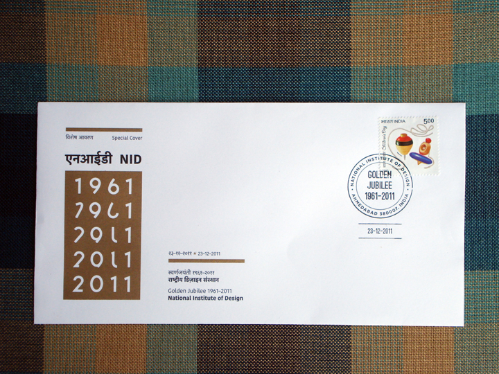
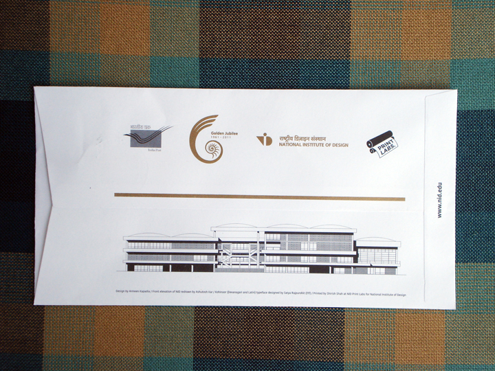
I had been trying to write more in detail about the process and experience of designing the NID First Day Cover. The project started in 2008 and finished around a year later. Hence, it required a little more of an effort to recall the entire experience. Just recently, Perch interviewed me electronically on the same topic, and the questions enabled me to give structure to my thoughts. You can read the interview here. A Special Cover is much like a First Day Cover, but it does not have a commemorative postage stamp like a First Day Cover has. One can put any stamp on it to post it.
This cover was designed as part of my Diploma Project in 2008. The guide for the project was Shilpa Das, and the sponsor was Research & Publications, NID. It was released on December 23, 2011, in Baroda. Many thanks to Pradyumna Vyas and Shilpa Das for facilitating the process with India Post. Many thanks to Tarun Deep Girdher, Shirish Shah and the entire staff of NID Print Labs for tirelessly and patiently working to do a great job of it. Many thanks to Satya Rajpurohit of Indian Type Foundry for letting us use the Kohinoor Latin and the accompanying Kohinoor Devnagari typefaces on the Cover. Many thanks to Ashutosh Kar, a senior from Graphic Design, NID, whose drawing of the NID elevation we used on the back of the cover. Many thanks to Elton, Vidhi, Vijith, Shivani, Sanjay and others who stuck stamps and folded envelopes in the Printing Lab. Many, many thanks to Sanjay Basavaraju for looking after the whole process, co-ordinating, and making it happen. Lots was learnt in the course of this project, and will share more of that and all the experiences later. Will update this post with details of the project and more images post 15th February 2012. These Special Covers are available with Research & Publications, NID. Picture this. A large, cool and comfortable room. A group of men sitting around a conference table. Everyone is at least 50 years, or older. Most of them are academics, or have worked in universities, often in administrative levels, most of their lives. They have requested 3 young designers to come and 'share their expertise' with them. A quick summary below --
The task at hand: Designing the university certificates. The design tools: A projector, and a university employee with a laptop. The design solution (as desired by them): Anything that looks 'good'. Definition of good: Widely debatable. As we sat at that table (yes it was two friends/colleagues and me at that table), we very rapidly realized the blokes in front of us don't really know or understand what design is. We can't blame them for that. After all, design is still shrouded in mystery for most folks. Putting it mildly, they did't really have a clue, and they haven't the foggiest idea of what we can do for them. We were regarded by some with suspicion, and by some with relief. Initially, it seemed as if they wanted us to guide the man working on the laptop, as he typed in the various nuggets of information that would appear on the certificate. We could all see what he did on the projection screen. The gentlemen were constantly giving him advice, designerly and otherwise, but mostly designerly. "Use Algerian font, it's the best.", "Should the logo come on top, or should the university name come first?", "Should we have English or Hindi first?", "University naam curve pe dal (place the university name in a curve)", and many, many more such golden words of wisdom was freely shared. It was both hilarious and tragic at the same time, besides being mildly bizarre. Why were we designers called? To be witness to the 'design by committee' process perhaps, and give it our stamp of approval. At any rate, it proved very hard to explain to some of the gentlemen there what design was, and how it happened. It ideally did not happen in an hour, on a projection screen, with everyone giving their opinion on it. Most of the time we just sat quiet. This caused one of them to laughingly say,"They are not revealing their trade secrets." Yes, if by trade secrets he meant we don't design by popular vote, he was right. Another gentleman, who was more understanding conceded, "No they will do it on their own, when we give them the content." This university logo was a strange, convoluted being. It was a product of some quick Google searches, Illustrator live-trace option, and ad-hoc colour selection. When we asked who the designer was, there was no clear answer besides, "Ermmm..". There was no question of re-designing this poor logo, yet, "Do something so that it looks nice." Basically, apply a Band-Aid on it when it actually needs major surgery, or complete reconstruction. There are numerous people, organizations, institutes, and bodies like this, where design is a mysterious word. Or design is simply beautification. How does one explain design to someone, who doesn't have a clue as to what design is? How does one explain its value, its process, its role and importance? How can you tell someone that design is more that just its tools? Needless to say, we didn't get into it then and there. What's the biggest difference between working by hand (illustration for instance), and working on the computer? It is the absence (or presence) of Ctrl Z. When you draw by hand, you can't undo things easily. The thing drawn remains drawn (dammit!).
The Ctrl Z (or undo option) has changed the way we work and the way we think. Since everything can be undone, sometimes nothing is done very seriously. On the other hand it emboldens us to try new things, however stupid they may seem. Ctrl Z is forgiving. It tells you, you are human, you can do it again, don't sweat it. When you work by hand, you are slower and surer, because you have to be. It is old-school. Working by hand takes the examination first and gives you the education later. If you fail, you start all over. Ctrl Z has taken the edge of drawing. It has given us a plan B. Ctrl Z (Command Z) is a state of mind, which becomes a whole way of working. You can take three leaps forward, because you know that you can always reverse in minutes. Ctrl Z has created a culture of impatience, but also a culture of limitless experimentation. The digital camera has been the Ctrl Z culture of photography. Previously, people used film. It had to be loaded, used, wound, spooled, developed, fixed, and finally printed into a contact sheet. The long process ensured that we carefully composed our shots, and only took a shot if we were pretty sure that was what we wanted. You ended up with photos that were fewer in number, but better in quality. With the digital camera you may shoot hundreds, and still may not turn out with a great one. That's because we shoot without thinking. Ctrl Z has made us (among other things): 1) Fast 2) Exploratory 3) Indecisive Since humankind is at that incredibly exciting stage of leaping from the Gutenberg era to the iPad era, both eras stand to gain the best from each other. And in the process both are evolving almost faster than we are. In this day and age, we can't imagine a designer without a computer. It's almost impossible to function. Unless the designer is that rich or famous that she/he has an army of design slaves to execute their design ideas. And even then they will need the computer for basic communication. Still, there are extremes even in this.
Recently I had the opportunity to meet a German professor, who was trained at Ulm. He uses Indesign in a very different way. He actually codes the software to do exactly what he wants, when he wants it, so there is very little manual work. He believes that it is a machine, and hence built for the level of precision that we humans can never master. The human brain/hand is always liable to make a mistake. So why not use that precision to advantage? He rarely places objects manually in files, but has trained the software to carry out commands, all purely mathematically. The workspace looks different from a conventional Indesign screen. Of course, he can do all this because he has miles of experience behind him, is a true master of the grid, and understands coding and computers. It does make sense, to actually make full use of the computer as a machine. He gives the commands, and Indesign obeys them, laying out the publication. The computer is his slave. At the other end of the spectrum are some students of typography in Jaipur. A friend visited them recently. There are a few in the class who have never worked on a computer before. To the extent that a couple of them don't know of the very basic computer interactions. For instance, they had no concept of a drop-down menu. The teacher first had to teach them that. It is akin to teaching a student how to hold a book, open it, or how to use the pencil. This means that we take our relationship with the computer for granted. We intuitively know where the drop-down menu is, where the buttons are, and we can react accordingly, without thinking. But for a newbie, who perhaps has never worked on a computer, it can be learning from scratch. The computer has become the tool most fused with the human brain and hands. But it still can't substitute the real tool of the human mind. Designers need to develop that tool first, to make best use of other tools. Only the intellect can think of ideas, concepts, and weigh them. Creative thought comes from humans, not machines. Microsoft Word can't write the Ramayana by itself. Working on the computer should not become working for the computer. There are books on design, and then there are books on design. Some books on design simply showcase design work. They are compilations of the glitziest and best in the field, be it industrial design, typography, or illustration. Editors have worked to collect and collate the best work. Most designers tend to gravitate towards these books, especially in their design education. They seem to be the benchmark to aspire to. But in reality, these books teach little. They do affect style a lot, which may not always be desirable. This invariably creates a whole bunch of us who sub-consciously or consciously creating work that looks like the showcased work. Because like it or not, the human mind is like a sponge. Our eyes feed on things that get transmitted and processed in our hard drives (brains), and affect the kind of images and designs we later create. Meditating on the Logo Lounge book while doing a logo design job is not a great idea. Somewhere, even if we fight it, we get affected by the forms we have seen, and they tend to creep into our work. The downside is, it doesn't help original thought. Most of these showcase kind of books are nice to browse through at times. But they don't provide many insights, and they don't really teach anything of real value, about design.
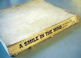
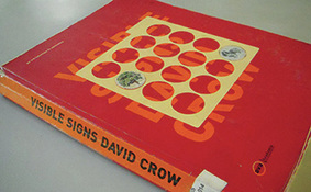
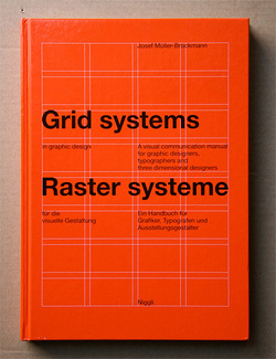
The kind of books that make a huge impact are of a different pedigree altogether. They don't just show work, they challenge the way we work, and create new ways for us to think. One is, A Smile In The Mind by Beryl McAlhone, a must-read for any graphic designer. This is an excellent book to help one understand how to create images (images=any kind of visual communication). It explains the different kinds of images, visual puns, visual metaphors and so on. By studying the book one can analyse and understand images around us better. It helps to create images, and develop different kinds of thinking to create images. The book explains creativity, humour and visual wit, and their roles in design. Another great book is Visible Signs by David Crow. As consumers of visual art, people have become advanced readers of signs and signals. We decode meaning from images on many different layers. It is important for designers to have an understanding of how meaning is formed, and how it changes perceptions. Our desires, and our sense of our own identities are moulded and manipulated by signs and images around us. Communication has hierarchies that are deeply embedded in our societies. This also holds true for visual communication, different media carry different messages for us regardless of the content of the message. Visual language spans the full range of cultural and economic activity. Visible Signs makes us aware of implicit communication everywhere. Designing Design by Kenya Hara does showcase his design work, but in a much deeper way. Unlike most books which just show a final outcome, he shows and explains the entire process behind each piece of work. Not only is his design work phenomenal, but his writing is interesting and lucid. He gives many insights into Japanese culture, which is strongly reflected in his work. Change By Design by Tim Brown (a founder of IDEO) talks about the design work IDEO has done through the years. It has few images, but many lessons and insights. It is a great book on design thinking, and shows the power of design in systems. Designers rarely talk about the business aspect of their profession. Shel Kerby's Talent Is Not Enough is an eye-opening book. It has got everything a designer would need to know about actually running a design business, charging clients, making proposals and so on. Few of these things get taught in design school, so this book is an essential read. John Heskett's A Short Introduction to Design is a good read about what design encompasses. The Vignelli Canon by Massimo Vignelli is a superb summation of the process of designing. For graphic designers, especially publication designers, the big daddy of them all is The Grid System by Joseph Muller Brockmann. This book was published sometime in the late 1960s, but it is still a Bible for graphic designers today. The principles of good design don't change easily, and this book has been written by one of the masters. This gentleman practically invented the grid system. He then also articulated it and made it easy for mere mortals like us to understand. These same principles are differently applied on the web, iPad, and any device today. This book explains the skeleton of good design. You never see it, but without it everything collapses. The grid is so important because it creates the system. The system creates hierarchy and consistency. These two together gives the reader essential cues. The cues help the reader read. One kind of book is the icing, while the other is the recipe for the cake. Many books strongly influence style, without really educating. Few books actually make designers. If design is problem-solving, these solid books are educators in their own way. Happy reading! It's a strange phenomena, but most people, including a lot of graphic designers think fonts are free as the air we breathe (which, I have no doubt, will cost us one day). But typefaces/fonts are not. A huge amount of effort goes into creating a single typeface. And that is just one basic version of it. More effort goes into creating different weights of the entire family. Yet, fonts are the most plagiarized of all resources, more than even the Internet or Wikipedia. I used some 'illegal' (not purchased) fonts too, as a student. In the Indian context, a lot of people think buying fonts is just a waste of money, not realising the importance of buying fonts for commercial and published work. Some fonts are expensive and may eat away a good chunk of their design budget. People's reactions range from:
Fonts aren't free? What the hell! Why bother, lets just use a pirated version. Why are we thinking of these fonts? Lets just download from dafont.com Can't we use this font and just change it a bit? Ok, lets use only those pre-loaded on the machine, at least that way we can save money and still be legal. Can they sue us? Lets buy some fonts. It's a good investment. Sadly a very slim percentage of the population will say that last line. People need to be informed and educated about the importance and value of fonts. A lot of people ask the second last line. It's only the fear of punishment that makes people want to do the right thing. Why should we buy fonts? 1) They are good investments. When you buy a good workhorse font, from a type foundry, it goes a long way. You get a whole font family, that could be anything from two to forty weights. Just that one font family alone can be used in innumerable ways, in countless projects, over the years. Take into account the fact that most good fonts have been around for decades (Helvetica) or centuries (Caslon, Didot, Bodoni). One solid font family purchased today can probably be used most of your lifetime. 2) It's the right thing to do. There is no other way to explain this. 3) Respect the creator. When you buy fonts, you are respecting, acknowledging and encouraging the designer somewhere, to create more. If everyone stopped buying fonts and used pirated versions, font designers would have to give up their careers. And then we would all be stuck using Helvetica forever. 4) There are fonts, and then there are fonts. Sites like dafont.com have their time and place, I believe. It's passable to use those fonts in student projects, your brother's class poster or a card for your girlfriend. In short, they are mostly (not always) amateur. It's not a great idea to use them on a client brochure, or a magazine, or for any professional/commerical work. Many times these fonts won't be kerned right, or won't have all the necessary glyphs. A lot of fonts on such sites are tweaked, squeezed and squashed versions of real, solid fonts. 5) The great are invisible. The really good fonts work invisibly and silently. They won't be shouting for you to see them. In fact, you may not notice them. They are designed to aid reading, not draw attention to themselves. So if you want people to actually read your text, and not just admire it, these are the fonts to go for. That is why big news agencies or newspapers commission their own fonts which are highly readable. Fonts are carriers and dispensers of content. Have a fontastic week. |
Archives
June 2018
Categories
All
LinksThe New Yorker Old Blogs |


 RSS Feed
