|
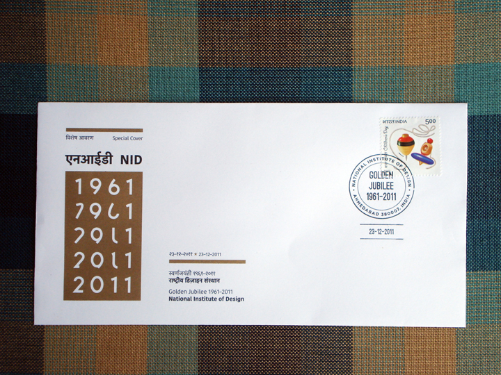
A Special Cover is much like a First Day Cover, but it does not have a commemorative postage stamp like a First Day Cover has. One can put any stamp on it to post it.
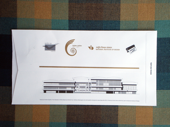
This cover was designed as part of my Diploma Project in 2008. The guide for the project was Shilpa Das, and the sponsor was Research & Publications, NID. It was released on December 23, 2011, in Baroda. Many thanks to Pradyumna Vyas and Shilpa Das for facilitating the process with India Post. Many thanks to Tarun Deep Girdher, Shirish Shah and the entire staff of NID Print Labs for tirelessly and patiently working to do a great job of it. Many thanks to Satya Rajpurohit of Indian Type Foundry for letting us use the Kohinoor Latin and the accompanying Kohinoor Devnagari typefaces on the Cover. Many thanks to Ashutosh Kar, a senior from Graphic Design, NID, whose drawing of the NID elevation we used on the back of the cover. Many thanks to Elton, Vidhi, Vijith, Shivani, Sanjay and others who stuck stamps and folded envelopes in the Printing Lab. Many, many thanks to Sanjay Basavaraju for looking after the whole process, co-ordinating, and making it happen. Lots was learnt in the course of this project, and will share more of that and all the experiences later. Will update this post with details of the project and more images post 15th February 2012. These Special Covers are available with Research & Publications, NID.
0 Comments
Just finished proofreading somebody's Diploma (thesis) document. I don't have any right to divulge the topic and the details of it, but part of it was about the development of language, script and how we read letters and words. There is still no really conclusive theory on how language developed. Was it to express emotion, need, signal danger, or for the purpose of trade? Who knows. We don't really know how or why humans started making intelligent sounds and then giving signs to the sounds they made. This was a huge evolutionary leap. Animals too have complex language and communication systems, but human language has developed to an abstract system of signs.
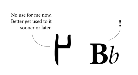
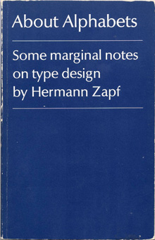
The letter A is just a notion of the sound it represents. The 'A' could well be a square or circle instead of A. At some point in our long and convoluted history somebody decided we needed signs to communicate. And that was the beginning of script. Many scripts developed out of a need to keep accounts for trade purposes. Stringing these signs together in various groups led to the formation of words and sentences. We never really read every letter in a word, we just read the word as a group. Reading is as much about pictures as it is about words, because at the end of the day, words are pictures. When someone asks the spelling of the word, one may actually see the word in their head, and know that if it 'looks' wrong, the spelling is wrong. I know, for instance, the i must come after the e, by the image in my head. If e is before i, my brain recognizes it is visually wrong. It doesn't spell wrongly, it looks wrong. It is easier to know spelling when you visualize it. The images of letters that we know today have developed over thousands of years. We have accepted them as much as we have accepted the noses on our faces. Language (especially one's mother tongue) seems to be hard-wired in us. There is very little effort required in thinking or talking in one's mother tongue. We all learnt language at such a tender age, we usually cannot recollect anything to do with the process. It probably wasn't very hard, or we would have vivid memories of it. Learning a second language however, usually proves harder. Most people remember struggling, or at least making more efforts with Hindi, Marathi, English, French or any other language that they learned a little later. Between the ages of approximately 2 to 6, the 'language window' in little human brains is wide open, more than it will ever be in life again. Between these years, children can effortlessly pick up 3 or 4 languages being spoken around them. No one (or very few) will question why A looks the way it does. Why can it not look like X, or a circle? World over, the speakers of a language have a general, unspoken agreement over the form of letters. Adding or removing a letter from a language is like adding or removing a limb. Generations may pass before people realise the loss of a letter, or even a matra. And by then it may be too late to bring it back. Most people may ask, what's the big deal in the loss of a letter, the language is simply evolving. That may be the case, but the loss is still very real. A letter may not have a tangible value, but it carries a wealth of information, symbology, history, culture and identity with it. Adding a letter is also serious business. First, the need for a new letter needs to be strongly felt by most people. How will people know what a new letter means, unless it is told to them repeatedly? Somehow, words are easily dropped from and added to any working language, but letters, not so easily. The loss of languages is a very real threat to culture and diversity world over. We are illiterate when we look at ancient scripts. The Indus Valley script still has the world flummoxed after thousands of years. Changes in scripts have occurred over millennia, often for very down-to-earth reasons. For instance, Gujarati lost the line on top of the letters that Devnagari has simply because the Gujaratis are predominantly a business and trading community, and the loss of the line enabled them to write faster for maintaining accounts and lists. Similarly, a thousand years from now our alphabet may be completely different. We form the language we speak, but it also forms us. About Alphabets – Some Marginal Notes on Type Design by Hermann Zapf
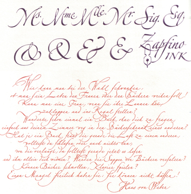
The M.I.T. Press, Cambridge/Mass. And London, England The humble size and unassuming cover of this book reflect the character of the author, Hermann Zapf, in that he is not one to shout about the work he has done, even though his accomplishments in the field of type design and calligraphy are unparalleled. The book is a simple autobiography of one of the greatest graphic and type designers of our time. Written in the first person, the book is an interesting account of his early beginnings, and his development. Being trained in the old school of type design – when letters were drawn by hand and then manually cut out of metal blocks – he provides interesting insights and observations that would rarely occur to modern day typographers and graphic designers. For example, the kind of metal used to engrave out the letters was of prime importance, and it was a relief when lead was introduced, as it lent itself to re-soldering, and new bits and pieces could be fused into the original block of the letter if too much had been cut off. At the same time, several of his concerns hold true even today, such as the basic aspect of readability, and durability of the typeface after thousands of print runs. Hermann Zapf is not concerned with purely the aesthetic aspect of letter forms, (and he is a master of this) but also spends large amounts of time and energy with the functional aspect. Being a calligrapher par excellence reflects in some of his creations, of which there are several examples in the book. The author also briefly touches about his enlistment in World War 2, and the trauma it inflicted. Even during the war, he spent spare time sketching the forms of flora and fauna, as a base for a Flower Alphabet he was to create. After the war, the author starts creating typefaces for specific clients and purposes, and sets up his own Stempel Foundry. Later in the sixties he talks about his experiences in teaching in the USA, and also his involvement with book binding and publishing. As Hermann Zapf himself acknowledges, it is a hard task to write an autobiography about oneself, but he has managed it with aplomb. The book is what its title claims it to be ‘marginal notes on type design’. Although a few more personal experiences included would have encouraged more readership. Nevertheless, one can feel his passion for typefaces and their creation, when he often refers to them as ‘children’ or ‘daughters’, having different parents, and he talks about the process to ‘name’ the ‘child’. And indeed, in that time, creating a typeface was a longer and possibly harder process than having a child, with as much joy at the end. The author reflects on culture, the dwindling time people have for reading (even in those days), and how that affects the role of a type designer. Though schooled in the traditional way of creating type, he projects the new challenges for type designers, as photo-compositing and newer technologies become mainstream. Though deeply inspired by the past, by typographers and letterers of previous centuries, and masterpieces of type such as the Trajan column, he looks keenly to the future, and warns against the ‘romanticizing’ of the past. He also softly, though manifestly shows his dislike for ugly new typefaces sprouting like weeds, especially the craze of sans-serif types. The book is of small size, easy to hold, and set in Linotype Optima, one of his own graceful creations. The line spacing differs, as the closer set text is a commentary on the main text, and is an interesting way of writing an autobiography, rather like two voices of the same person speaking simultaneously. He favours unusual punctuation in place of speech marks, which is quite refreshing. Of all his fonts, my personal favourite is Zapfino, which is a delicious blend of calligraphy and typography. Somehow, he has combined the two, while doing justice to both. The result is beautiful, graceful letter forms, with generous sweeps and swirls. He is also the creator of Palatino. This is a book that anyone interested in type design and typography can read, as it is informative and inspiring. More importantly, it is a first-hand account of the journey and struggle of a type designer, the challenges he faced working with the technology at the time, and the culture prevalent in those years. |
Archives
June 2018
Categories
All
LinksThe New Yorker Old Blogs |
 RSS Feed
