|
It's amusing to see minorities which number in millions. That's the wrong use of the word 'minority', right? They should be called minor majorities. Now take us Parsis, we are the only ones who know the real meaning of 'minority'. At last count there are around 1,00,000 of us worldwide (that's one lakh for the numerically challenged). The more optimistic amongst us (me included) peg the figure at 1.5 or 2 lakhs, because we count a pretty large population hiding out.. oops.. living in Iran. And the smart 30,000 or so who have settled in the US and UK. The other real minorities would be Jews, Armenians, honest politicians…you get the picture.
You know you're from the Parsi minority when: 1) You jump with joy when you meet anyone else who is also Parsi. 2) In college you're lucky if you can find three other Parsis in the entire campus. One year at NID I found five and was practically ecstatic. 3) As you move away from the strongholds of Mumbai and Pune, you find yourself increasingly explaining who you are and when you're from. 4) You rejoice when you meet a non-Parsi who knows something about your community. 5) You spend hours tirelessly explaining the beginnings of your community, and how you are neither Muslim nor Hindu. 6) You spend even more hours explaining why you speak Gujarati (and English) as a mother tongue. A friend of mine actually believed that we spoke a language called Parsi. I had to enlighten him that it was Farsi, nor Parsi, and very few Parsis speak it anymore. 7) When you meet another Parsi, you know you'll eventually figure out how you're both related after an in-depth conversation about relatives and friends. "Acha, so you're Rustom's cousin! Arey, Rustom is very close to us. He is my maasi's husband's cousin's mama's nephew's dog's owner's wife's mother's step-son!" 8) You have a long, convoluted, and/or highly unusual first name, and are so used to spelling it out you hardly bother saying it anymore. Easier to just shut up and hand over a business card. 9) Many people live hand-to-mouth. But Parsis live meal-to-meal. 10) You take great pride in Parsi-owned companies such as Tatas and Godrej, and gloriously defend their honor in public (even if deep down you don't believe it).
2 Comments
 Just finished proofreading somebody's Diploma (thesis) document. I don't have any right to divulge the topic and the details of it, but part of it was about the development of language, script and how we read letters and words. There is still no really conclusive theory on how language developed. Was it to express emotion, need, signal danger, or for the purpose of trade? Who knows. We don't really know how or why humans started making intelligent sounds and then giving signs to the sounds they made. This was a huge evolutionary leap. Animals too have complex language and communication systems, but human language has developed to an abstract system of signs.
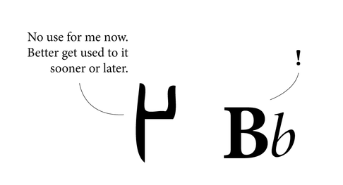
The letter A is just a notion of the sound it represents. The 'A' could well be a square or circle instead of A. At some point in our long and convoluted history somebody decided we needed signs to communicate. And that was the beginning of script. Many scripts developed out of a need to keep accounts for trade purposes. Stringing these signs together in various groups led to the formation of words and sentences. We never really read every letter in a word, we just read the word as a group. Reading is as much about pictures as it is about words, because at the end of the day, words are pictures. When someone asks the spelling of the word, one may actually see the word in their head, and know that if it 'looks' wrong, the spelling is wrong. I know, for instance, the i must come after the e, by the image in my head. If e is before i, my brain recognizes it is visually wrong. It doesn't spell wrongly, it looks wrong. It is easier to know spelling when you visualize it. The images of letters that we know today have developed over thousands of years. We have accepted them as much as we have accepted the noses on our faces. Language (especially one's mother tongue) seems to be hard-wired in us. There is very little effort required in thinking or talking in one's mother tongue. We all learnt language at such a tender age, we usually cannot recollect anything to do with the process. It probably wasn't very hard, or we would have vivid memories of it. Learning a second language however, usually proves harder. Most people remember struggling, or at least making more efforts with Hindi, Marathi, English, French or any other language that they learned a little later. Between the ages of approximately 2 to 6, the 'language window' in little human brains is wide open, more than it will ever be in life again. Between these years, children can effortlessly pick up 3 or 4 languages being spoken around them. No one (or very few) will question why A looks the way it does. Why can it not look like X, or a circle? World over, the speakers of a language have a general, unspoken agreement over the form of letters. Adding or removing a letter from a language is like adding or removing a limb. Generations may pass before people realise the loss of a letter, or even a matra. And by then it may be too late to bring it back. Most people may ask, what's the big deal in the loss of a letter, the language is simply evolving. That may be the case, but the loss is still very real. A letter may not have a tangible value, but it carries a wealth of information, symbology, history, culture and identity with it. Adding a letter is also serious business. First, the need for a new letter needs to be strongly felt by most people. How will people know what a new letter means, unless it is told to them repeatedly? Somehow, words are easily dropped from and added to any working language, but letters, not so easily. The loss of languages is a very real threat to culture and diversity world over. We are illiterate when we look at ancient scripts. The Indus Valley script still has the world flummoxed after thousands of years. Changes in scripts have occurred over millennia, often for very down-to-earth reasons. For instance, Gujarati lost the line on top of the letters that Devnagari has simply because the Gujaratis are predominantly a business and trading community, and the loss of the line enabled them to write faster for maintaining accounts and lists. Similarly, a thousand years from now our alphabet may be completely different. We form the language we speak, but it also forms us. 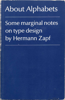 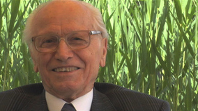 About Alphabets – Some Marginal Notes on Type Design by Hermann Zapf The M.I.T. Press, Cambridge/Mass. And London, England The humble size and unassuming cover of this book reflect the character of the author, Hermann Zapf, in that he is not one to shout about the work he has done, even though his accomplishments in the field of type design and calligraphy are unparalleled. The book is a simple autobiography of one of the greatest graphic and type designers of our time. Written in the first person, the book is an interesting account of his early beginnings, and his development. Being trained in the old school of type design – when letters were drawn by hand and then manually cut out of metal blocks – he provides interesting insights and observations that would rarely occur to modern day typographers and graphic designers. For example, the kind of metal used to engrave out the letters was of prime importance, and it was a relief when lead was introduced, as it lent itself to re-soldering, and new bits and pieces could be fused into the original block of the letter if too much had been cut off. At the same time, several of his concerns hold true even today, such as the basic aspect of readability, and durability of the typeface after thousands of print runs. Hermann Zapf is not concerned with purely the aesthetic aspect of letter forms, (and he is a master of this) but also spends large amounts of time and energy with the functional aspect. Being a calligrapher par excellence reflects in some of his creations, of which there are several examples in the book. The author also briefly touches about his enlistment in World War 2, and the trauma it inflicted. Even during the war, he spent spare time sketching the forms of flora and fauna, as a base for a Flower Alphabet he was to create. After the war, the author starts creating typefaces for specific clients and purposes, and sets up his own Stempel Foundry. Later in the sixties he talks about his experiences in teaching in the USA, and also his involvement with book binding and publishing. As Hermann Zapf himself acknowledges, it is a hard task to write an autobiography about oneself, but he has managed it with aplomb. The book is what its title claims it to be ‘marginal notes on type design’. Although a few more personal experiences included would have encouraged more readership. Nevertheless, one can feel his passion for typefaces and their creation, when he often refers to them as ‘children’ or ‘daughters’, having different parents, and he talks about the process to ‘name’ the ‘child’. And indeed, in that time, creating a typeface was a longer and possibly harder process than having a child, with as much joy at the end. The author reflects on culture, the dwindling time people have for reading (even in those days), and how that affects the role of a type designer. Though schooled in the traditional way of creating type, he projects the new challenges for type designers, as photo-compositing and newer technologies become mainstream. Though deeply inspired by the past, by typographers and letterers of previous centuries, and masterpieces of type such as the Trajan column, he looks keenly to the future, and warns against the ‘romanticizing’ of the past. He also softly, though manifestly shows his dislike for ugly new typefaces sprouting like weeds, especially the craze of sans-serif types. The book is of small size, easy to hold, and set in Linotype Optima, one of his own graceful creations. The line spacing differs, as the closer set text is a commentary on the main text, and is an interesting way of writing an autobiography, rather like two voices of the same person speaking simultaneously. He favours unusual punctuation in place of speech marks, which is quite refreshing. Of all his fonts, my personal favourite is Zapfino, which is a delicious blend of calligraphy and typography. Somehow, he has combined the two, while doing justice to both. The result is beautiful, graceful letter forms, with generous sweeps and swirls. He is also the creator of Palatino. This is a book that anyone interested in type design and typography can read, as it is informative and inspiring. More importantly, it is a first-hand account of the journey and struggle of a type designer, the challenges he faced working with the technology at the time, and the culture prevalent in those years. 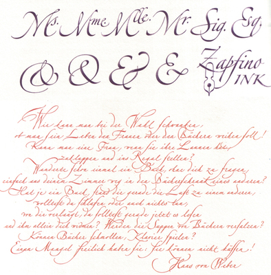 I don't know what it is, but spelling and grammar mistakes seem to be on the rise. It could be the auto-correct in Microsoft Word and Google that's pampering (read spoiling) everyone's language benchmark. It could be just sheer laziness, or too many distractions around us. It could be the falling standards of education. It could be the rise of digital devices. We still don't know the real long-term implications of all this technology around us. If mobile phone waves are killing sparrows, they might be messing with our spelling skills too.
Speaking of mobiles, we can definitely dump some of the blame on the mobile phone and smsing. I love mobile phones and technology. Bt myb thts y we all rite like dis now, evn n collg. Ders no time. I hv frgten de real splings of tings. I also rite in rely shrt sntnces nw. Dis proves we can read ny wrd easly. But we can't use language like that in printed/published work (not yet at least). Language standards, in India can be surprisingly low in places where they should be high. Pick up the Times of India. On any given day, you can usually find one spelling plus one grammar mistake, and you won't even have to read the entire paper to discover them. Errors are especially rampant in the supplementary paper such as Ahmedabad Times. Surprised? Don't be. Recently, someone pointed out a spelling error in a Penguin book. English is definitely not the easiest language to master, with more exceptions than rules. The er and the ar are often confused. "I went to collage." (You couldn't have gone to a work of art). Some errors of course result in pretty hilarious situations. Recently we witnessed the 'Osama/Obama is dead' situation. A slip of one letter can mean something drastically different. Imagine the "Diving Mother that helps one in time of need." (Divine became a water sport). The slips between s and c are countless. Receive and abscess can deceive us all. And you might want to discus something or throw the discuss. Viscous can be vicious to spell. You are pretty likely to find some mistakes in this post, if you read carefully enough. Received this on Facebook (where else?). Some great books and authors are missing. Where is PG Wodehouse? And Dr Zhivago? Or Stefan Zweig? Yet, an interesting list.
Have you read more than 6 of these books? The BBC believes most people will have read only 6 of the 100 books listed here. Copy this into your NOTES on Facebook. Bold those books you've read in their entirety, italicize the ones you started but didn't finish or read an excerpt. Tag other potential book nerds. 1 Pride and Prejudice - Jane Austen 2 The Lord of the Rings - JRR Tolkien 3 Jane Eyre - Charlotte Bronte 4 Harry Potter series - JK Rowling 5 To Kill a Mockingbird - Harper Lee 6 The Bible 7 Wuthering Heights - Emily Bronte 8 Nineteen Eighty Four - George Orwell 9 His Dark Materials - Philip Pullman 10 Great Expectations - Charles Dickens 11 Little Women - Louisa M Alcott 12 Tess of the D’Urbervilles - Thomas Hardy 13 Catch 22 - Joseph Heller 14 Complete Works of Shakespeare (abridged) 15 Rebecca - Daphne Du Maurier 16 The Hobbit - JRR Tolkien 17 Birdsong - Sebastian Faulk 18 Catcher in the Rye - JD Salinger 19 The Time Traveler’s Wife - Audrey Niffenegger 20 Middlemarch - George Eliot 21 Gone With The Wind - Margaret Mitchell 22 The Great Gatsby - F Scott Fitzgerald 24 War and Peace - Leo Tolstoy 25 The Hitch Hiker’s Guide to the Galaxy - Douglas Adams 27 Crime and Punishment - Fyodor Dostoyevsky 28 Grapes of Wrath - John Steinbeck 29 Alice in Wonderland - Lewis Carroll 30 The Wind in the Willows - Kenneth Grahame 31 Anna Karenina - Leo Tolstoy 32 David Copperfield - Charles Dickens 33 Chronicles of Narnia - CS Lewis 34 Emma -Jane Austen 35 Persuasion - Jane Austen 36 The Lion, The Witch and the Wardrobe - CS Lewis 37 The Kite Runner - Khaled Hosseini 38 Captain Corelli’s Mandolin - Louis De Bernieres 39 Memoirs of a Geisha - Arthur Golden 40 Winnie the Pooh - A.A. Milne 41 Animal Farm - George Orwell 42 The Da Vinci Code - Dan Brown 43 One Hundred Years of Solitude - Gabriel Garcia Marquez 44 A Prayer for Owen Meaney - John Irving 45 The Woman in White - Wilkie Collins 46 Anne of Green Gables - LM Montgomery 47 Far From The Madding Crowd - Thomas Hardy 48 The Handmaid’s Tale - Margaret Atwood 49 Lord of the Flies - William Golding 50 Atonement - Ian McEwan 51 Life of Pi - Yann Martel 52 Dune - Frank Herbert 53 Cold Comfort Farm - Stella Gibbons 54 Sense and Sensibility - Jane Austen 55 A Suitable Boy - Vikram Seth 56 The Shadow of the Wind - Carlos Ruiz Zafon 57 A Tale Of Two Cities - Charles Dickens 58 Brave New World - Aldous Huxley 59 The Curious Incident of the Dog in the Night-time - Mark Haddon 60 Love In The Time Of Cholera - Gabriel Garcia Marquez 61 Of Mice and Men - John Steinbeck 62 Lolita - Vladimir Nabokov 63 The Secret History - Donna Tartt 64 The Lovely Bones - Alice Sebold 65 The Count of Monte Cristo - Alexandre Dumas 66 On The Road - Jack Kerouac 67 Jude the Obscure - Thomas Hardy 68 Bridget Jones’s Diary - Helen Fielding 69 Midnight’s Children - Salman Rushdie 70 Moby Dick - Herman Melville 71 Oliver Twist - Charles Dickens 72 Dracula - Bram Stoker 73 The Secret Garden - Frances Hodgson Burnett 74 Notes From A Small Island - Bill Bryson 75 Ulysses - James Joyce 76 The Inferno - Dante 77 Swallows and Amazons - Arthur Ransome 78 Germinal - Emile Zola 79 Vanity Fair - William Makepeace Thackeray 80 Possession - AS Byatt 81 A Christmas Carol - Charles Dickens 82 Cloud Atlas - David Mitchell 83 The Color Purple - Alice Walker 84 The Remains of the Day - Kazuo Ishiguro 85 Madame Bovary - Gustave Flaubert 86 A Fine Balance - Rohinton Mistry 87 Charlotte’s Web - E.B. White 88 The Five People You Meet In Heaven - Mitch Albom 89 Adventures of Sherlock Holmes - Sir Arthur Conan Doyle 90 The Faraway Tree Collection - Enid Blyton 91 Heart of Darkness - Joseph Conrad 92 The Little Prince - Antoine De Saint-Exupery (English) 93 The Wasp Factory - Iain Banks 94 Watership Down - Richard Adams 95 A Confederacy of Dunces - John Kennedy Toole 96 A Town Like Alice - Nevil Shute 97 The Three Musketeers - Alexandre Dumas 98 Hamlet - William Shakespeare 99 Charlie and the Chocolate Factory - Roald Dahl 100 Les Miserables - Victor Hugo Note to self: Visit library! As the title suggests, I have been toying with various subject matters to write about. Should I write about design, write about writing, write about India, people, places, food, the importance of breakfast, the rise of consumerism, the rise of food prices, the state of education, the lack of good education, the pitfalls of design education, the vanishing forest cover, the vanishing Parsis, the almost vanished tigers, ugly urban architecture, beautiful traditional architecture, unbelievable politicians, soaring corruption, starving farmers, farmers with BMWs, mobile phone plans, fair and lovely/handsome advertisements, creeps on motorbikes, families on scooters, chauffeurs in Audis, bhelwallas, the helpful staff at the Bank of India, the not-so-helpful staff at the Pune bus stand, chaotic traffic, load-shedding, weight-gaining, Indesign crashing, the superior nature of Apple, or the charm of the printed word?
Speaking of words, people say we don't think in words, we think in pictures, but I think that we think in words too. If a picture is worth a thousand words, then a word is also worth a thousand pictures. Words and pictures, or language and visuals are two sides of the same coin, the coin of communication or expression. As human beings we can't live without these two essential tools of our own creation. The earliest humans expressed themselves through images, as seen in cave paintings. Even today some of the richest expressions, such as those of tribal artists, are in the form of images. Language came much later. But then language turned out to be such a powerful, fascinating tool, and gripped humankind with such intensity for generations, that now we can't live without it. It is as essential to us as breathing. More than the Printing Revolution, or the Internet Revolution, it must have been the Language Revolution, or rather Evolution, that has actually had the maximum impact on us till today. I was flitting through a book Empires of the Word — A Language History of the World by Nicholas Ostler, and it's fascinating to see how one can actually study the history of the world through its languages. Language is deeply intertwined with perception, colonization, economic strength, religion, and much more. Indeed language is much more than just words. It's how we think, how we feel, it's the lens to our entire reality. Any language has phrases, metaphors, and even certain words unique only to that language, and carries in it centuries or millennia of meaning, culture and tradition. Language has DNA as well, in its words, sounds, subtle meanings and double meanings. Concepts of gender, direction, transaction, self-consciousness and ego-centricity stem from language and are affected by it. Does your language shape how you think? I think yes. Though the language of designers is visuals (supposedly), there are some designers on whom the wordy language still has a strong grip. A very interesting project is Mandagrams by Johnson Banks, an amazing graphic amalgamation of two languages. It almost seems like a return to hieroglyphics. With the rise of mobile technology and twitter-talk, maybe the future of language will be some kind of 'designed' system of modern, hyper-efficient and ultra minimalist hieroglyphics. |
Archives
June 2018
Categories
All
LinksThe New Yorker Old Blogs |
 RSS Feed
