|
This review contains spoilers Once in a blue moon you get to see a movie that is so real, moving and brave, you can't forget it for a long time. Das Leben der Anderen (The Lives of Others) is about the suppression of artistic, literary and intellectual expression in East Germany. Any piece of writing, theatre, movie, or art is strongly controlled by the Government of the day, known as the Stazi. Any piece of work not in keeping with their propaganda, is censured and controlled to the point of complete destruction. The Stazi often resort to bugging people's homes with devices, and spying on their every word and act. The only thing that remains private are thoughts, and even they get exposed through double-crossers. An officer of the Stazi is given the job to closely watch a couple. The man is a playwright, and the woman an actress who stars in most of his works. They know what suppression has done to their close friend, a film maker, who did not abide by the rules. Stifled by the lack of any opportunity to work freely, he is completely destroyed. The Stazi dictates how any creative person tells their story, paints their paintings, makes their films, or enacts their performances. This couple still seek to find a way out for their creative voice. The officer who is listening into their every conversation in a dingy attic, begins to be strangely moved by things he hears. From being completely pro-Stazi, he goes over to the other side, in a slow progression. As a continuously falling drop of water ultimately shatters a rock, this officer's rigid beliefs are slowly broken down, one by one, as he listens to their way of life. His whole identity, his very being undergoes a transformation, proving that even in the hardest of people, there is still a human heart. The story has more plots and complexities, and is a deep tale of love, politics and double-crossing. The Stazi officers often search the couple's apartment when they are away. At one point, this officer secretly pockets a book he sees lying about. Later, at home, he opens and reads the book, a simple act that has been discouraged and almost banned by the Stazi. The beauty of the moment, when he discovers that simplest and happiest of joys, of just pure reading, is indescribable. The words on the page give him happiness, after years of being brainwashed that books are bad. There are many more such moments in the film. The playwright meanwhile gets a chance to write a story about the harsh realities of East Germany, and be published in a West German magazine, remaining anonymous all the time. He is provided with a special typewriter to do this task, in utmost secrecy. The typewriter becomes the most dangerous object in the house, for if it is found, it has dire consequences for the couple. It is almost like a deadly piece of evidence, the murder weapon, or the corpse, which the Stazi struggle to find, and no one wants to reveal. Everything revolves around it, at one point. It is a life and death situation, quite lliterally. The writer's tool becomes the most incriminating piece of evidence, for the crime of honest writing. The woman has her own struggle and anguish, as she is used and abused by the powers that be, and remains helpless through it all. She is at the mercy of a man in power. She sells her soul to buy the couple the little creative freedom that they enjoy. How far would one go for one's art? Far becomes too far at times. Tragically, the double life she leads destroys her from within, as it has done to others. Only the playwright gets the chance for meaningful contribution to his work, but he pays heavily for it in other ways. Lives are lost for creative expression, something which is taken for granted many a time. Yet, in an culture of animosity and supression, a hard-headed officer begins to trust again.
0 Comments
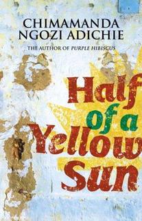 Half of a Yellow Sun is gripping and award-winning book by Chimamanda Ngozi Adichie. It is about the civil war in Nigeria and the struggle to create a new country, Biafra, back in the sixties. It is told through the eyes of Ugwu, a loveable, young houseboy, who comes to work in the house of a revolutionary African professor, Odenigbo. Ugwu is from the village, and everything is strange and fasinating to him. His master is a kind man, who treats him as an equal. Later, the love of Odenigbo's life, Olanna, daughter of a rich Government servant, moves in with them. The book explores human relationships deeply, the relationships and dynamics between man and woman, servant and master, woman and child, man and mistress, people and their government, people and the rich, people and their oppressors, rulers and the ruled, blacks and whites. Local identity overrules the national identity, and also overules common sense and humanity, especially at times of war. War is the great leveller, making refugees out of an entire nation.
Ugwu, Odenigbo and Olanna struggle with the life that has been thrust upon them. Things get worse before they get better, and they undergo trying circumstances, with remarkable strength. This is especially true for Olanna, who grew up in luxury, never wanting anything, but adjusts to life without the basic necessities. They forgive each other, even when grievously wronged, and their very unique bond is the only thing that gets them through extremely hard times. As you read, you feel their pain, and find yourself praying that they get through this alive. The author makes the reader experience the war raging outside, by narrating the war within each of them, and between them. In pain, people do strange things and hurt one another, and these are no exception. They come very close to losing all hope and sanity, but they are pulled back when they are at the brink, by a return to normalcy. Though a novel, it is based on real events, and very real emotions. A great author understands that you can't make people experience an actual event, you can only make them experience the emotions that make the event so real. Chimamanda Ngozi Adichie is one such author. Through their dialogues, the book raises larger questions which plague countries that underwent colonial rule. The Nigerian struggle to be their own people, to stop bowing to all Western thought, the enforcing of a national identity, the love of one's country are all issues that any thinking Indian grapples with on a daily basis, even unconsciously. Worse than the economic and political oppression that a colonial power creates, is the loss of identity, the loss of the sense of self, and the hatred of one's fellow citizens, that are the real left-overs of colonial rule. These take generations to remedy. Odenigbo's hope and burning idealism to see a truly independent Nigeria, free of the colonial shadow, almost kills him internally, while the war kills everything externally. In this day and age, we can't imagine a designer without a computer. It's almost impossible to function. Unless the designer is that rich or famous that she/he has an army of design slaves to execute their design ideas. And even then they will need the computer for basic communication. Still, there are extremes even in this.
Recently I had the opportunity to meet a German professor, who was trained at Ulm. He uses Indesign in a very different way. He actually codes the software to do exactly what he wants, when he wants it, so there is very little manual work. He believes that it is a machine, and hence built for the level of precision that we humans can never master. The human brain/hand is always liable to make a mistake. So why not use that precision to advantage? He rarely places objects manually in files, but has trained the software to carry out commands, all purely mathematically. The workspace looks different from a conventional Indesign screen. Of course, he can do all this because he has miles of experience behind him, is a true master of the grid, and understands coding and computers. It does make sense, to actually make full use of the computer as a machine. He gives the commands, and Indesign obeys them, laying out the publication. The computer is his slave. At the other end of the spectrum are some students of typography in Jaipur. A friend visited them recently. There are a few in the class who have never worked on a computer before. To the extent that a couple of them don't know of the very basic computer interactions. For instance, they had no concept of a drop-down menu. The teacher first had to teach them that. It is akin to teaching a student how to hold a book, open it, or how to use the pencil. This means that we take our relationship with the computer for granted. We intuitively know where the drop-down menu is, where the buttons are, and we can react accordingly, without thinking. But for a newbie, who perhaps has never worked on a computer, it can be learning from scratch. The computer has become the tool most fused with the human brain and hands. But it still can't substitute the real tool of the human mind. Designers need to develop that tool first, to make best use of other tools. Only the intellect can think of ideas, concepts, and weigh them. Creative thought comes from humans, not machines. Microsoft Word can't write the Ramayana by itself. Working on the computer should not become working for the computer. 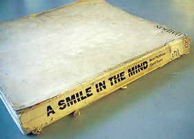 A Smile In The Mind at the NID Library 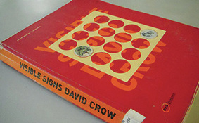 Visible Signs at the NID Library There are books on design, and then there are books on design. Some books on design simply showcase design work. They are compilations of the glitziest and best in the field, be it industrial design, typography, or illustration. Editors have worked to collect and collate the best work. Most designers tend to gravitate towards these books, especially in their design education. They seem to be the benchmark to aspire to. But in reality, these books teach little. They do affect style a lot, which may not always be desirable. This invariably creates a whole bunch of us who sub-consciously or consciously creating work that looks like the showcased work. Because like it or not, the human mind is like a sponge. Our eyes feed on things that get transmitted and processed in our hard drives (brains), and affect the kind of images and designs we later create. Meditating on the Logo Lounge book while doing a logo design job is not a great idea. Somewhere, even if we fight it, we get affected by the forms we have seen, and they tend to creep into our work. The downside is, it doesn't help original thought. Most of these showcase kind of books are nice to browse through at times. But they don't provide many insights, and they don't really teach anything of real value, about design. The kind of books that make a huge impact are of a different pedigree altogether. They don't just show work, they challenge the way we work, and create new ways for us to think. One is, A Smile In The Mind by Beryl McAlhone, a must-read for any graphic designer. This is an excellent book to help one understand how to create images (images=any kind of visual communication). It explains the different kinds of images, visual puns, visual metaphors and so on. By studying the book one can analyse and understand images around us better. It helps to create images, and develop different kinds of thinking to create images. The book explains creativity, humour and visual wit, and their roles in design. Another great book is Visible Signs by David Crow. As consumers of visual art, people have become advanced readers of signs and signals. We decode meaning from images on many different layers. It is important for designers to have an understanding of how meaning is formed, and how it changes perceptions. Our desires, and our sense of our own identities are moulded and manipulated by signs and images around us. Communication has hierarchies that are deeply embedded in our societies. This also holds true for visual communication, different media carry different messages for us regardless of the content of the message. Visual language spans the full range of cultural and economic activity. Visible Signs makes us aware of implicit communication everywhere. Designing Design by Kenya Hara does showcase his design work, but in a much deeper way. Unlike most books which just show a final outcome, he shows and explains the entire process behind each piece of work. Not only is his design work phenomenal, but his writing is interesting and lucid. He gives many insights into Japanese culture, which is strongly reflected in his work. Change By Design by Tim Brown (a founder of IDEO) talks about the design work IDEO has done through the years. It has few images, but many lessons and insights. It is a great book on design thinking, and shows the power of design in systems. Designers rarely talk about the business aspect of their profession. Shel Kerby's Talent Is Not Enough is an eye-opening book. It has got everything a designer would need to know about actually running a design business, charging clients, making proposals and so on. Few of these things get taught in design school, so this book is an essential read. John Heskett's A Short Introduction to Design is a good read about what design encompasses. The Vignelli Canon by Massimo Vignelli is a superb summation of the process of designing. For graphic designers, especially publication designers, the big daddy of them all is The Grid System by Joseph Muller Brockmann. This book was published sometime in the late 1960s, but it is still a Bible for graphic designers today. The principles of good design don't change easily, and this book has been written by one of the masters. This gentleman practically invented the grid system. He then also articulated it and made it easy for mere mortals like us to understand. These same principles are differently applied on the web, iPad, and any device today. This book explains the skeleton of good design. You never see it, but without it everything collapses. The grid is so important because it creates the system. The system creates hierarchy and consistency. These two together gives the reader essential cues. The cues help the reader read. One kind of book is the icing, while the other is the recipe for the cake. Many books strongly influence style, without really educating. Few books actually make designers. If design is problem-solving, these solid books are educators in their own way. Happy reading! 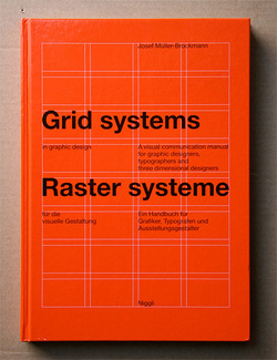 Grid Systems  Joseph Muller Brockmann Have seen some good, and some strange movies lately. A most unusual movie is The Symbol (Shinboru). This movie has very little dialogue. But it just proves that non-verbal communication is as powerful as any other. Written, directed, and starring Hitoshi Matsumoto, it starts with a man alone in a large white room. You don't know what the hell is going on, but it all comes together in the end. And what an ending it is. It is as if you have been let it on a bigger secret, which nobody knows of yet. In short, an extremely creative and dont-give-a-dam director has been able to pull this off with aplomb. The Great Debaters, is based on a true story, and explores the struggle of black people in 1930s America. An idealistic college professor at Wiley College, inspires and trains four young black students to debate against white students, in colleges across the United States. On a deeper level, it is about their search for identity, their fight for equality, and their need to be heard. The movie is a little predictable, and not as inspiring as it could be, but still, worth a watch. It is filled with interesting quotes from literature, and allusions to Gandhi. True Grit is by one of my favourite movie-makers, the Coen Brothers. Based on a book, it's a touching story of a young girl's search for her father's murderer. She teams up with a US Marshall, and the movie is about their adventures together. Set in old-time America, it is slow in parts, but definitely worth a watch. Yet, it is not as brilliant as the Coen Brothers' other films. A Serious Man is a brilliant one, a combination of wit, sarcasm, and just plain randomness. Centered around an American suburban character, set in the late 1960s, it involves his wife, kids, neighbours, colleagues, and his thoughts and reactions to all of these. Only Coen Brothers can take the most everyday things, and make them so interesting. Who needs fiction, when life itself is so rich in beauty? The Coen Brothers' crowning masterpiece has to be No Country For Old Men. It's a hair-raising, excruciatingly suspenseful film. A hitman is on the lose in Texas, and the murders get increasingly cold-blooded, random and bold. It's not the actual killing that kills you, but the danger and suspense. Without too much of a show of blood or gore, the audience experiences the very real terror that a serial killer inspires. You can feel the cold hand of the murderer somewhere around you, while he silently and menacingly swings his axe. You can never actually be rid of his clammy and frightening face, with its deadpan eyes. The movie has a strange ending, but it's probably the most appropriate one. With A Serious Man, you are going to get some laughs. With No Country For Old Men, you are going to be looking over your shoulder for a couple of days, or weeks, depending on how jittery you are. The Coen Brothers are masters of making you feel things that you can't really express later. Their movies defy description. If anyone can express movies in just words, why go through the effort of making the movie? Some may find them a tad violent, but Coen Brothers tells it like it is. As an old man says in the film, "You can't stop whats coming." Thats it for the movie updates. 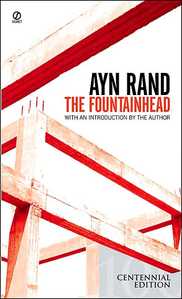 A good weekend is one where you get to relax. A great weekend is one where you finish reading two juicy books! I finally finished The Fountainhead (very late in life). It is an epic, with a really strong dose of some pretty headstrong philosophy thrown in. This was the Centennial Edition, and at the end of it were notes, reviews, and edits by the author herself. These were more illuminating than the book itself, and give us a little peek into Ayn Rand's formidable brain. Books like this are pure hard work, sweat, blood and toil as the notes confirm. Not that she was complaining about the work. She was her own most stringent critic and heartless editor. Rand started work on the characters of the book a few years before actually starting the book. Each character has been sketched out in detail, with descriptions of the physical, mental, emotional and spiritual aspects. Some of these characters are not used in the final book. Then there is her own first review of her first chapter. The notes read 'too many adjectives', and 'don't use words for the sake of it, use them only if really needed' and many more notes to that effect. Each chapter has its own review. More than the books, I would love to get my hands on the journals of Ayn Rand, and they do exist. She also interned at an architect's office for a year prior to writing the book, as part of her in-depth research. A monumental undertaking, this book must have been. It's one thing to have a strong, unique and original philosophy. Its quite another to build a fictional world around it, that is detailed to the nth degree. And it's the ultimate, if you have the sharp reasoning to cut, trash and re-write portions and pages of your work. She designed this book, and crafted every word, thought, and blink, down to the last comma. One minute I was on the sidewalks of New York in the last century, with Roark challenging all existence, the next minute I was crossing medival Europe and stepping into ancient Iran. In Search of Zarathustra by Paul Kriwaczek is a non-fiction work about his own journey across countries, centuries, and gods. A Polish Jew and a dentist, he had a long-time fascination with Zoroastrianism, and its beginnings and influences. He believes Zoroastrianism has influenced Christianity, Judaism and Islam, infact many world religions much more than anything else. Its just that its never been documented. And since Zoroastrianism has been in the twilight zone for 1300 years, its even harder to get evidence of anything. But it does exist, as he takes us through his long journey through Europe and finally to Iran via Turkey and many other places. Some interesting points are that Avestan, the ancient language is surprisingly close to Old Sanskrit. In fact some prayers when translated, are almost exact. The author, and some others believe that it was one band of people from Central Asia that separated into two branches. One settled on the river Indus, and the other on the river Oxus (now the Amu Darya). The custom of shaking hands, apparently can be traced to Zoroastrian culture, as it was not originally Christian, and definitely not Islamic. It is also shown in some Iranian sculptures. Zoroastrianism also strongly influenced ancient Egypt, a fact unknown to most of the world. This is probably because history is written by the winners of the last war. One fact that comes out glaringly in this book is how present day history is dominated by Roman/Greek history, and is strongly one-sided. The Zoroastrian empire at its height, stretched from Egypt to the Indus (Kushan) and from Rome to the Gulf. It was, by all accounts, the greatest civilization of the ancient world. It was the first time in recorded history that the rulers were 'civilsed' in the true sense, being tolerant, open-minded, and just. Many other religions were allowed and encouraged to flourish within the empire too. For instance, Cyrus gave the persecuted Jews a home, and let them flourish. Yet, all this never gets mentioned in history. The world started and ended with the Roman Empire. And films like 300 don't do anything to help this. Now I understood where the two-winged symbol so common in ancient Egypt came from. The beginning of the book is a bit tedious, but later chapters are engrossing and deeply moving (for a Parsi reader). He explores Iran, and visits sites of the great civilization. There are still Zoroastrians living in Iran, and practicing the faith. He visits the ancient sites of Cyrus and Darius, analyses and links Iranian art and sculpture to other times, cultures and places. Even in ancient days, it is astonishing to know the amount of cross-cultural exchange that happened. Finally, someone enlightened me about the beginnings and significance of the festival of Noruz, still celebrated worldwide. In spite of centuries of Islamic rule, Noruz (Navroze) is celebrated in a very Zoroastrian way in Iran, as it has been since the beginning. Infact, Muslims in Iran are extremely proud of their pre-Islamic heritage, though they might not be very well-informed about it. The author ponders on the beginnings of Zoroastrianism, which was in the Bronze Age. We can imagine what people were like in medieval times, but its hard to imagine life in that era. What was life like then? Did the same things move people? And what was the prophet Zarathushtra himself like? These are questions that will always remain unanswered. However his teachings, thoughts and philosophies are relevant even today. Externally life changes, but internally humans remain the same, and the same issues of ethics, morals, and meaning of life plague us since the beginning of time. The author set out to find this ancient and all-but-lost culture and religion. He was looking for signs, symbols, places and events, but in the end, he is led to Zarathustra's core teachings. That is the thread that lives on inside people, that is the thread that connects us to people of the Bronze Age, and connects us to Zarathustra himself. 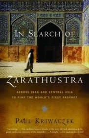 The Wikileaks logo is a world melting/leaking into another world. It is also an hourglass. Great symbolism on both fronts, as the world is changing fast, melting into something else, and Wikileaks might hopefully be part of that change. The tables have been turned. Since it is a veritable time bomb too, the hourglass. Strange thing is neither of the two globes show the Americas (for a change). Usually it's our part of the world that is chosen to face away from the viewer.
We don't know how long it will be before the thing explodes, something happens (God forbid) to Julian Assange, or governments get control of it (God and the Devil forbid that!). As of now it survives, or maybe even thrives. It's almost the biggest thing since Gutenberg or the Internet. There is nothing as exciting, enabling and empowering than 'secret' information suddenly being available. Are we a voyeuristic species? Probably yes, looking at the amount of 'forbidden' matter floating around the Internet, from porn to state secrets to conspiracy theories. But if Governments claim to be 'for the people', then what do they have to hide? Secrecy is the mother of suspicion. George Orwell said, "During times of universal deceit, telling the truth becomes a revolutionary act." 17–19 December 2010
National Institute of Design, Ahmedabad, India The last weekend was an interesting and informative one with the 14th conference of Vision Plus being held for the first time in a developing country, and whats more, right on home ground! Yes, it was organised by IIDj (Institute for Information Design Japan) and the NID (National Institute of Design) played host making it a great experience for all. There were numerous speakers from all over the globe and India, and the topics were diverse, ranging from mobile technology, to signage, to interfaces, to medicine packaging, to rural communication. There were eye-opening discussions, and I came away re-thinking the entire role of graphic design, and the growing importance of information design. Too many things around us, in fact the very important things around us are badly or inappropriately designed. It is an irony that we live in world where the Nike logo and packaging will be perfectly designed, but your bank form will be a test of patience and eyesight. Millions are spent on communication that will sell, but too little is invested in communication that will aid. Overall, some of the things I came away with are: 1) Text is as important as design (yay!). This was something I personally had felt since a long time, since I joined NID. The words that are forming part of your communication, be it online, in a leaflet, or on a strip of Crocin are important. Because people WILL read. They won't get the information they need just from admiring your pretty fonts. Re-writing the text, and re-structuring the text is as important, and in fact the first stage in providing a solution. Good design is not enough when the text itself is confusing or unclear. Of course good design really, really helps in communication, once the text is coherent. This was reaffirmed time and again in Vision Plus, especially by certain presenters such as Karel van der Waarde and Alex Tyers. Karel can der Waarde showed us how medicine packaging is mostly unreadable, and inaccessible even in Europe (surprise surprise!). Often pamphlets or some kind of literature is handed out with medicines in Europe, and these are hard to read. Even the text itself is confusing. Medicines have numerous complexities and layers such as one can't consume a certain drug if one has one of the ten conditions mentioned. This is often where text appears to repeat itself or get redundant. 2) Intuition is not enough. Too often designers tend to think that they know best, but as designers we have to go out there and understand users time and again. When we think something will work, we are just taking a personal stand point, and are missing out on hundreds of voices and opinions which may provide some enlightening insights. Design is not about personal choice and preference. 3) Research—design balance. A great question put forward by Karel van der Waarde (I think) in the end was how much should we as designers research, where do we draw the line, how do we walk that fine line of research and design? As Professor Ranjan (of NID) summed up, there is evidence-based design and design-based evidence, and they both are on two sides of a river, which needs to be bridged. 4) Design is focussed on what looks good rather that what works. Many people expressed this point, among them Jay Rutherford and Alex Tyers. Jay Rutherford rightly said that a standardly educated graphic designer tends to worry about how it will look rather than how it will work. This is the crux of the problem and the reason we encounter so much lousy design around us today. Most people (including many designers in India) think that if it looks beautiful its enough, even if the user can't read the 9pt type. This fascination with tiny typography actually rules out a huge reader base of forty-plus people, and those with weak eyesight. This can be accepted in a fashion magazine but not on heart medication, or insurance policies. 5) Design as a term is changing meaning daily. Today design may be enabling users to create their own solutions through workshops or other means. It could be helping people create their own tools to improve their life. Design is no longer 'giving' a 'solution'. Problems are being solved in new ways everyday. 6) You can't parachute into another culture to 'give' design solutions and parachute out. Jay Rutherford pointed out that too often Western designers think they can land in developing countries, tell people what to do, and leave. This, according to him, is a bad way of doing things. And I agree. Its not that Western designers cannot help developing countries, but they need to first spend months if not years in understanding the context, as it is so different and varied. An audience member rightly summed it up as 'we have to understand that we don't understand everything about other cultures'. Mr. Rutherford explained how information design in India is such a complex thing. Take the domain of road signage. Presently they are haphazard, and inconsistent. There is no system in short. We actually need city signage in three languages — Hindi, English and the local language. Now again, which order should they be in, and how large each should be is a matter of debate. Mr. Rutherford had a very keen observation about our Indian airports which set me thinking. He noticed, while in Bangalore airport, that the English signage was much larger than the Hindi and Kannada signage which immediately followed it. He was wondering why this was, and indeed it is strange that our own local languages have secondary importance. Probably we are one of the very few countries in the world to do that. Is it the colonial hangover? Is it because most people who can afford air travel are also predominantly English readers? 7) Culture and context are everything. Lakshmi Murthy and Tarun Deep Girdher showed us how important understanding a local culture is. And how rural India is a different world, of which we urban designers know naught. In rural India, the simplest of devices can work most effectively. I especially loved Lakshmi Murthy's solution for the pregnant women in rural Rajasthan. These women do not eat a proper diet during pregnancy because of many myths and habits. Women often eat last, and they eat left-overs. They sometimes believe things such as the baby needs space to grow, so don't fill that space with food, and so on. After educating the women on the importance of food, she has a simple tool to remind them to eat a well-rounded meal. She shows them an Indian flag, the tricolour. One can lift each colour strip to see the pictures of food below. For example, under the orange band there are all orange foods, under the white all white foods, and under green the green foods. This reminds women if 'have they eaten all the colours today?' This was information design at its best. A simple solution, easy to create, replicate, relate to and understand. 8) Can there be universal icons? Most probably not, precisely because of the above point. We may take some symbols for granted, such as the tick and the cross, which most of the educated world recognizes as right and wrong, or do and don't. Tarun and Lakshmi showed us how, in rural India however, the cross is seen as two bamboo sticks, or a kind of stand used in rural India. The object represented below the 'cross' maybe perceived by a rural audience as being placed on the stand. What's more, the tick mark maybe seen as a hatha-walla lota, a utensil used to serve water in India. So icons are not as powerful as designers like to think. In fact, they can add to confusion. In a very different context, Alex Tyers reaffirmed this same point. Even in Australia, a more homogeneous society, icons can be perceived differently by different people, and so he has not used them in some of his work where communication is effectively achieved through good typography. Users spend more time trying to figure out your icon, or worse, they interpret it wrongly. 9) Typo, typo, typo. Strangely, a lot of designers are averse to typography, and I have heard a lot of industrial designers comment on how it is over-hyped. Actually, one doesn't notice typography unless it's really bad, and then it's mostly too late. Good typography aids design much more than even I imagined. And this point was reflected in many people's presentations. Alex Tyers showed us a lot of work, which used typography effectively for really good communication. He started the presentation with 'You can put lipstick on a pig, but it is still a pig.' Barack Obama said this regarding something else, but it applies to design as well. Some important points that Tyers brought up were (and I am quoting his presentation here) a) To use a design effectively, a person must be able to see how to use the information it contains. In other words, the design should aid the user in finding what she/he wants. b)Think of design as a series of tasks a person must be able to perform rather than layout, typography and aesthetics. This is specially true for graphic designers, as too often we focus strongly on the latter and forget about what the user will need. I experienced exactly this while doing the Parsee book as well. It helps when you think 'What will the user want to do/read first?' c) The tasks relate to navigation, attention, and reading comprehension. d) People can visualise how to use information when — It is all located in one place — It is structured around tasks — It is in the order that people would use it e) This approach must be backed by — Writing information to support tasks — Typsetting that provides distinct voices for different people. This is really useful way to think about type. Often I struggled with the 'what font should I use for this?' syndrome. To imagine your text as having a voice is a great tool. What is it doing, giving an order, asking a question, pointing you some place, or providing an answer? — Editing out any distraction on areas that have a visualizing function (back to the universal icons point) 10) Is the design liberating? And finally, it was Shilpa Das who asked if the design is liberating for disabled people. This is a very valid point, and it can apply to design in general too. Sometimes design hampers us, and what was meant to aid, becomes a hindrance and a source of frustration. She said we have to 'listen to disabled people's voices'. We have to listen to everyone's voices, especially those of the disabled, women, children and the elderly. All in all, I learnt a lot from the various presenters, and have only noted things most pertinent to the field I work in. Unfortunately I missed part of day one, and was not able to attend each presentation. Have some videos which I will be posting soon. Information design is crucial, and has new challenges in a culture as diverse as India. Many thanks and congratulations to Rupesh Vyas, Andreas Schneider and the entire Vision Plus team. |
Archives
June 2018
Categories
All
LinksThe New Yorker Old Blogs |
 RSS Feed
