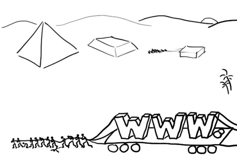
 Designed the site when Rameses II was building pyramid 3. Illustration: Armeen Kapadia Now I haven't done many sites, but the amount of misconceptions out there are astounding. Here's a few.
1) A site can be done in a day: Yes a few sites can perhaps be done in a day, but don't expect anything great. A website is not a blog. 2) No one reads: This is a classy one, one of the oldest in the book, and is genuinely and tragically believed by several designers too. That's why a lot of content out there sounds like blah blah blah. People can't really get solid information and facts from blue rectangles, moving stars, or purple stripes. Even photographs have their limitations, that's why they come with that little thing called captions. Words matter. And if you think they don't, you may have to eat your words. They aren't even that tasty. 3) Only look and feel matters: The term look and feel is frequently applied to any kind of visual design. This is like applying band-aids to cure jaundice. It just doesn't work. If the design is weak, all the surface cosmetics just won't help. And websites run way deeper than the page you see. 4) Interactive is cool, hep and in: Interactive is a word that should be banned (more on banned words later), along with other terms such as look and feel, cutting-edge, innovation and creative. These words have become as generic as 'nice' and 'good'. These poor words meant something once, in a glorious past, but now their value has dimished, and they are joining the ranks of 'jargon'. Interactive could mean anything. You and me talking is interactive. Interactive site may not equal functional site. ("This site is Awesome! But I've been looking for the Home page since yesterday.") 5) Flash is best: Steve Jobs doesn't use Flash in any Apple products. That says it all. Still looking for more proof? It makes things slow, provides pointless animations, and doesn't really have any function online. Out of 1000 websites using Flash, only one really probably needed it. It also looks like the website was created in 1742. BCE. ("I designed this site when Rameses II was building pyramid 3.") 6) Everyone uses the internet now: That's in a world where 'everyone' is 22 years old, wears Levis and eats at Subway. Thankfully, we don't live there yet. The real world has many forty-plus people who are not completely comfortable with the internet. Many small-town people may not be using it everyday. The worst mistake a designer can make is to assume everyone is just like them. Internet users are like underwear users. They can be anyone, anywhere, and you got to make something that is comfortable for all of them, however diverse they are. 7) Crack the home page and you are done: That's why the web is littered with home pages that are ornate, flashy, 'interactive', non-functional and look nothing like the other pages of the site. Inside pages need to be as functional and friendly as the home page. A home page needs to reflect the rest of the site without charging at you and knocking you flat with 1200 links. Or knocking you down with nothingness. Happy website-ing!
0 Comments
Leave a Reply. |
Archives
June 2018
Categories
All
LinksThe New Yorker Old Blogs |
 RSS Feed
